Theater Set Design
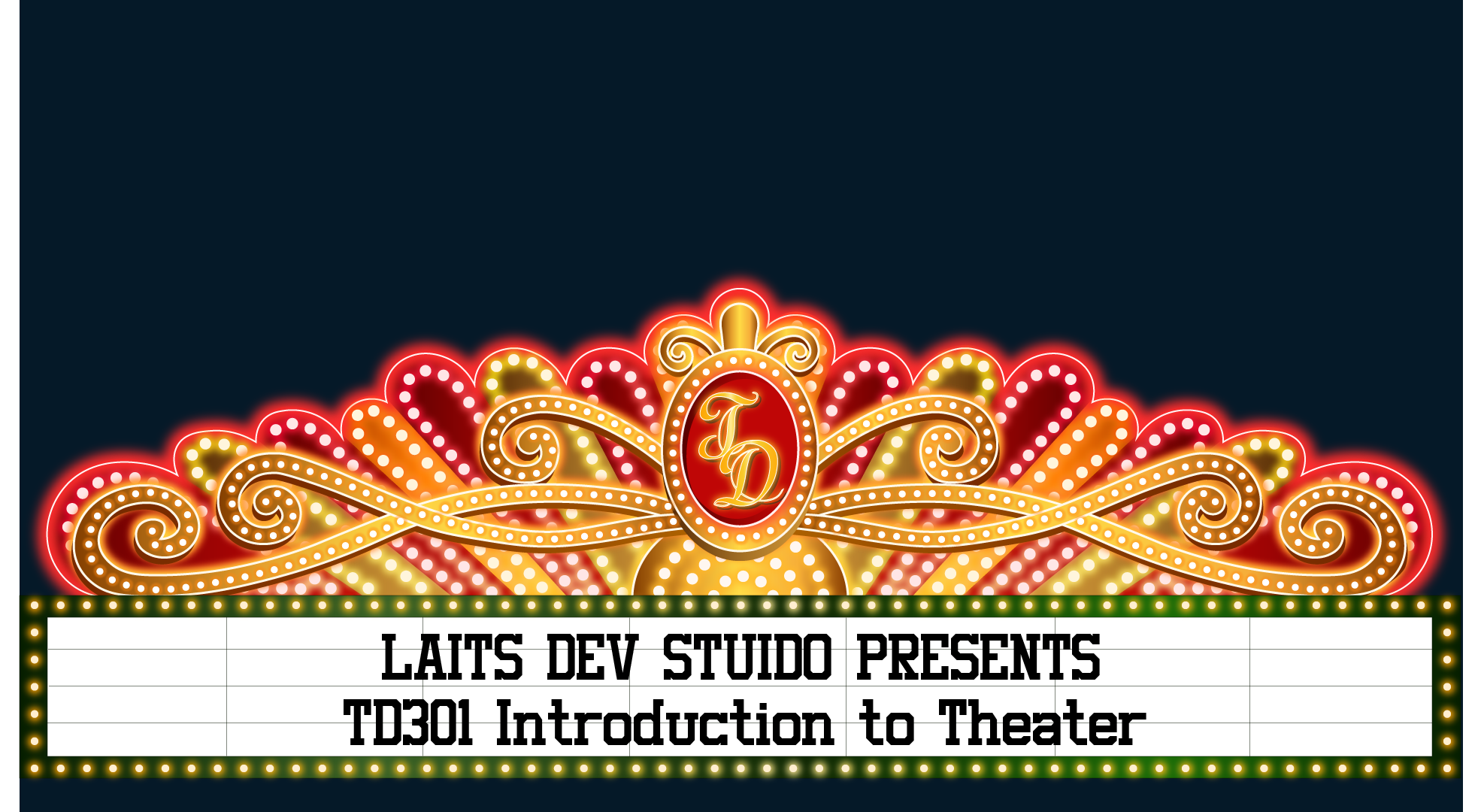
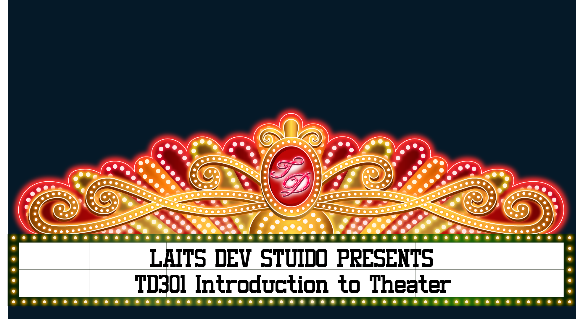
This week I’ve been focusing on the set graphic design for TD301, and it includes this marquee piece. I wanted to recreate the very exciting, sparkling colors of a marquee while still retaining the clarity of words, so I only chose two main colors. The alternating red and gold creates a strong contrast even with the dotted lights on, and I am very pleased with how it turned out.
I played around with a few different fonts to emphasize the initials in the center of the marquee, and I think I will stick with the last one because the letters are thicker. However, I do like how the pink neon lights of the second one looks overall with the gold and red, so I might come back and edit it a bit more after I work more on the center stage.


