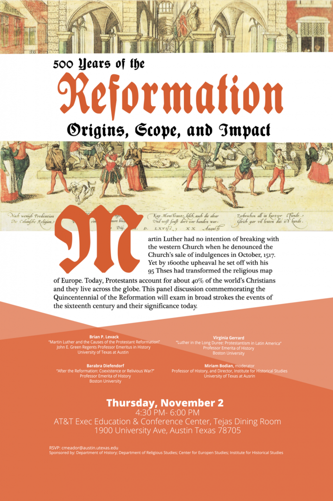
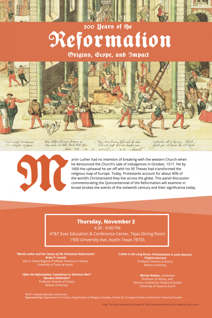
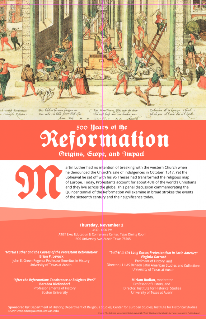
This past week I got the chance to design another poster! The history department is hosting an event commemorating the 500th anniversary of Martin Luther. I decided to use a Fraktur typeface more or less appropriate for the historical period, along with a bold “M” as a reference to illuminated manuscripts popular among religious texts from Martin Luther’s era. Below are my three iterations.
For the final iteration, the client asked for a more red color as well as more attention drawn to the speakers’ names and information. I scaled down the M slightly in order not to obscure the main image.


