[1/3] Poster Design: The Littlefield Lectures, Manisha Sinha
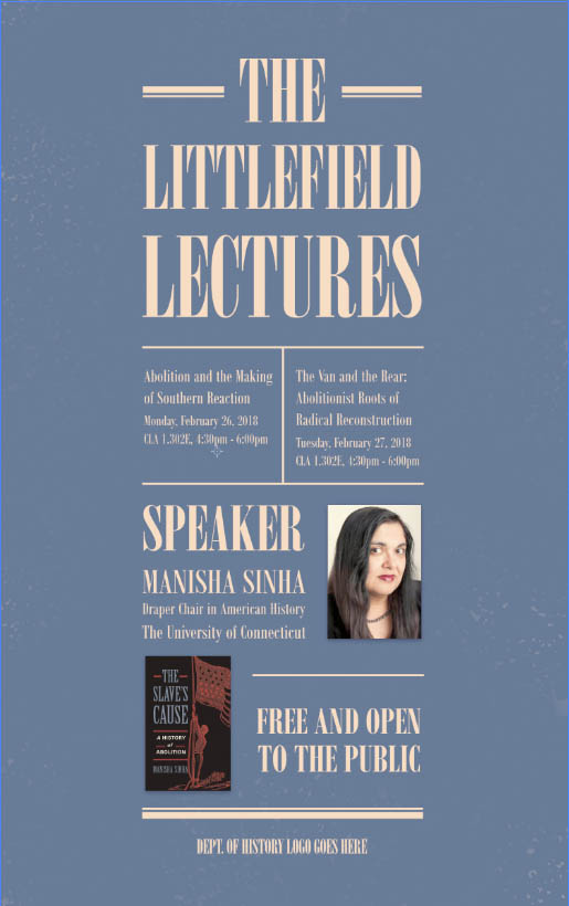
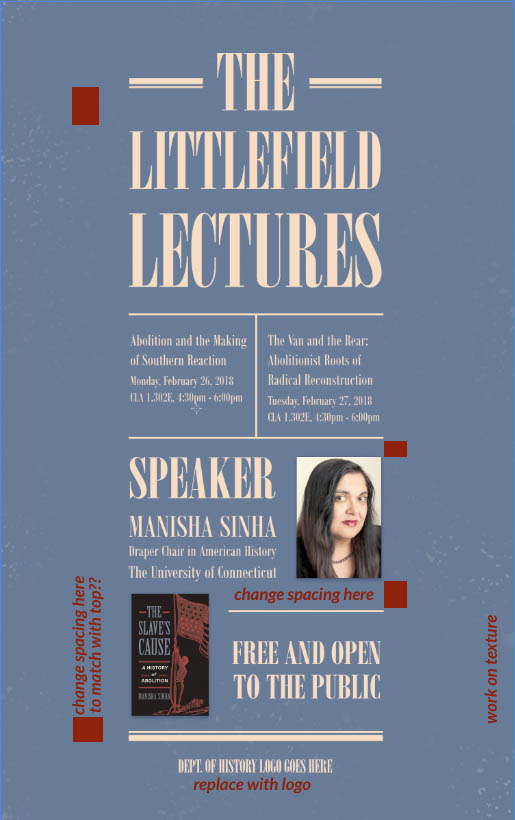
This is a poster for The Littlefield Lecture series. In this first draft, I’ve decided to depart from the previous design and create a new design. I based the overall design around the photo of the book cover I was given (the photo is featured in the poster). This is why I chose to use horizontal lines for accents, a sans-serif font, and colors similar to the book cover.
– Font: Bodoni MT, Poster Compressed | Compressed Bold
– Dimensions: 11″ x 17″ + 1″ Bleeds
– Currently saved as medium quality jpegs, will save in proper formats and file locations after first round of feedback
If this design winds up getting rejected, my fallback plan is to use the old poster as a template and make a new poster based off of the old one.
Potential Alternatives for Color
**These are NOT new drafts.**
These are just here to illustrate the possible color options if peach on white is not preferred. For the color palette, I sampled colors from the book cover featured in the poster. For the final first draft, I used a peach for the text. (It looks more yellow on here, but it’s pinker on my laptop.) Since the colors on my laptop tend to view warmer, I’ve included the hex codes below:
Hex Codes Background (blue): #687c98 | Text (peach): #f6ddc3
