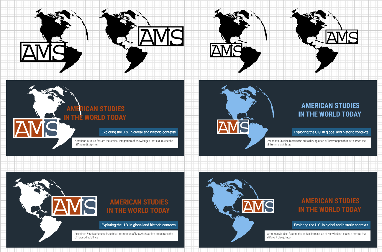
I am helping the American Studies department redesign their logo and banner for their homepage.
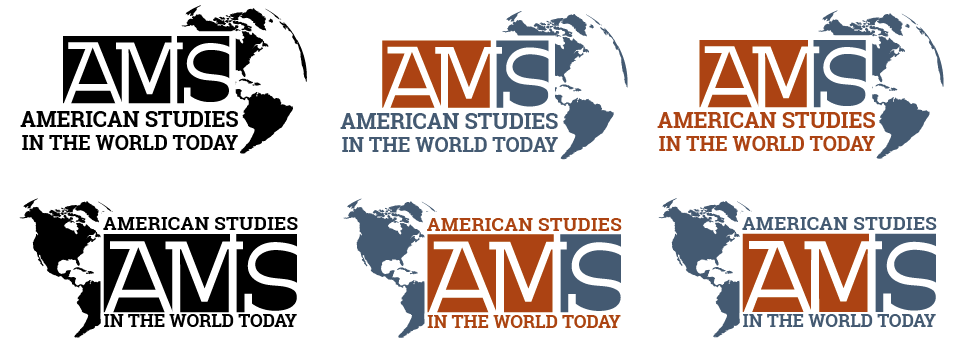
After a couple changes made that the client suggested, here is what the logo looks like:
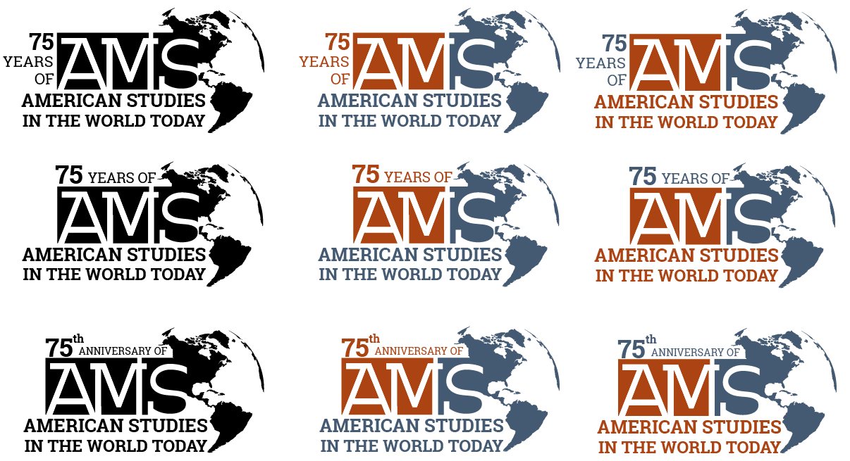
The client liked the first design, but felt that there needed to be an indication that this year is the 75th anniversary for AMS on the logo. Here are my latest drafts, with an added element: the 75th anniversary.
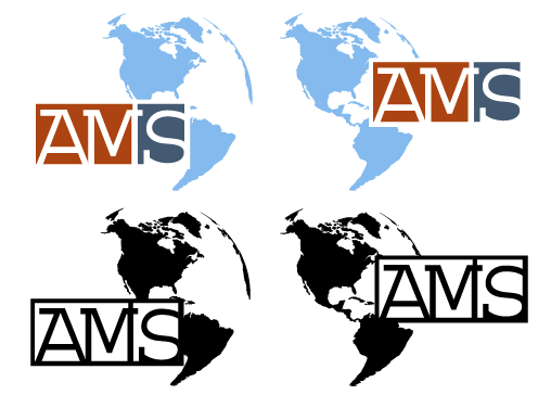
These are the options I sent to the client on 6/30:
–Version of 1 color & 1 b&w
where the AMS dominates the combined shape (AMS bigger)
–1 b&w version
where “AMS” lettering is white on black squares
–Versions where you are treating
- the western hemisphere
- “American Studies In The World Today”
- AMS
as a well balanced all in one logo.
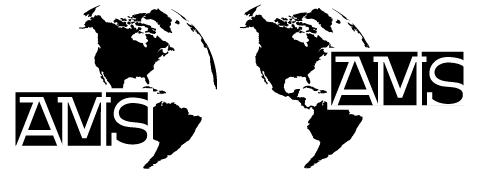
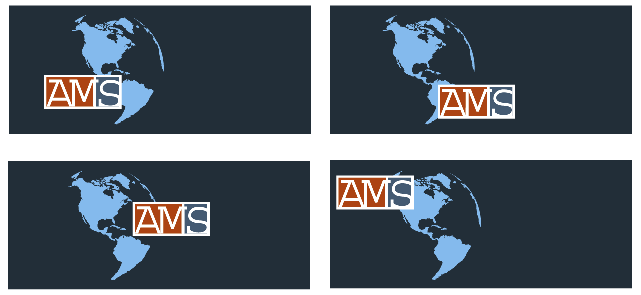
Here are my drafts from 6/24/2016.
Here are my first, very rough drafts. What I focused on with this draft was just the placement of the western hemisphere and the AMS sign.

