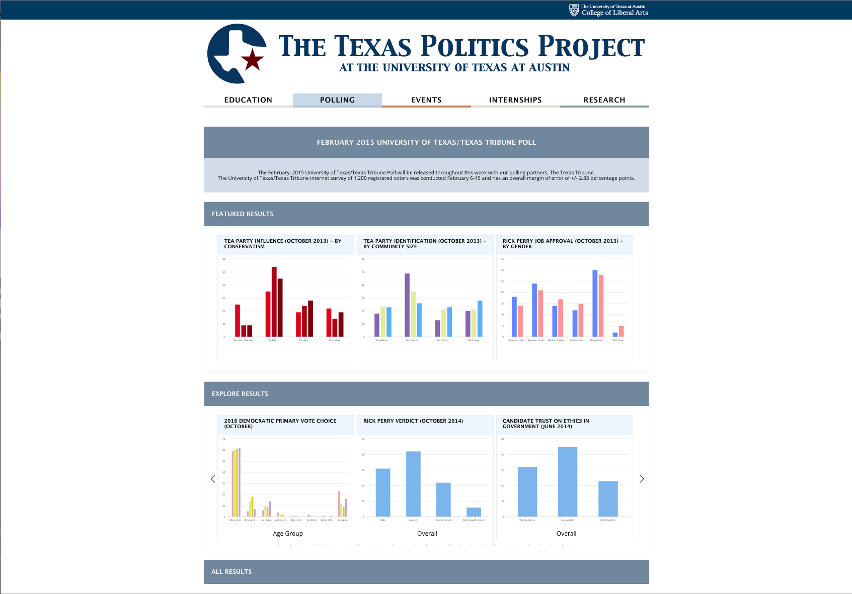
The Texas Politics website redesign was my first assignment. My job was to create a mockup of the Texas Politics Polling page. Because the page was responsive, I had to create mockups for the for the desktop and one for the mobile version. Before, the web page lacked color and division and because each section in the navigation of the Texas Politics website had certain color scheme, I chose a light blue color for the content and a dark blue for the header. The dark blue allowed the page have division which makes selecting which content to read easier.
Most of the design was done in the browser because when I am coding web pages I usually create the mockup in the browser because it provides a more realistic view of what the page will look like instead of working with photoshop document of fixed height and width. Eventually I went into photoshop and created mockup’s for the mobile version and for the desktop version to show the hover effect of the page. After the mockup was completed and accepted, I went in and coded the design of the page with HTML and CSS and some Javascript. The Javascript was to fix the issue of the search button to go inline with the search term. The table was generated with a Javascript plugin that presented data in a table. I had to manipulate the layout of the search section to go with the table.
The web page is now live here
The Desktop View of the “Latest Polling” section of the poll page

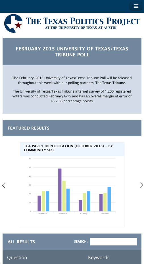
The mobile view of the “Latest Polling” section of the poll page. The borders around the graph was removed so the viewer doesn’t see the arrow navigation touching the border.

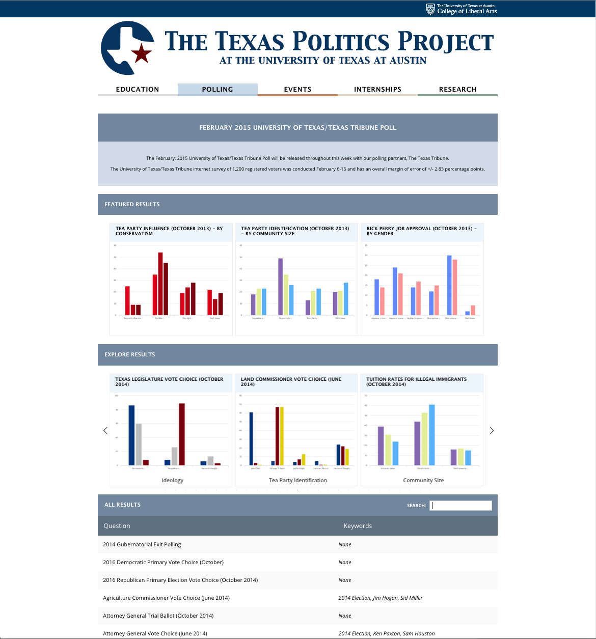
The Desktop View of the “Latest Polling” section of the poll page with table layout below. The search button is inline with the header of the graph instead of sitting on its own row.

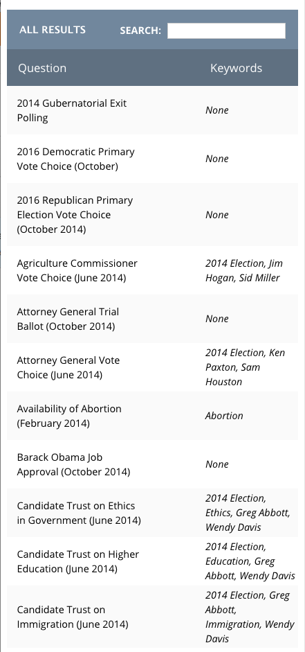
Table detail of the latest poll section mobile view. Each column has spacing to allow readability and to prevent the columns from overlapping.
