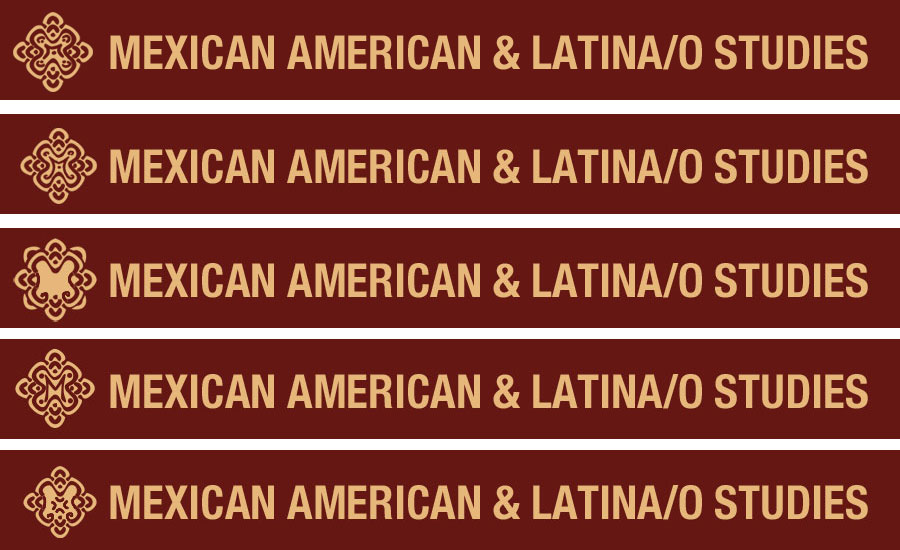
Project: MALS Logo Design
Completion status: In Process
LAITS design team: Tuan : student designer | Suloni & Andre staff design support
Description/plans: Begin design for the Department of Mexican And Latino/a Studies

Notes from 2nd meeting
The drafts in the link above reflect yours & Femi’s feedback from our second face to face deign meeting.
We would like to meet with Domino and come away with specific changesto the list below, before we start another round of drafts:
Colors for MALS branding:
Match the red and pale gold fromhttp://www.utexas.edu/cola/centers/cmas/
Choose a font that’s modern and bold
Logo & font should read clearly in strong in black and white, on black and white printed matter
Logo & font read well small on printed matter
Logo:
inspiration graphic:http://www.shutterstock.com/pic-106028222/stock-vector-vector-illustration-of-maroon-seamless-damask-pattern.html?src=bOZ7bIjJCgZm1au9Fx8Fow-1-27
use a stylized M in the center of the symmetrical logo design
make directional “arrow” styling arrows more more compass like, clean-up image, remove dots
show one of the icons + word mark on an off white, very pale almost white vanilla background – use the red for word mark font
show an icon with the acronym MALS below or beside i, instead of the whole title spelled out.
retain the diamond silhouette, make the design different enough so that it is no longer infringing copy-right
show a full configuration icon + word mark, with the UT word mark as a part of the brandhttp://www.utexas.edu/brand-guidelines/visual-style-guide/wordmark
Beginning Notes for 3rd meetingFrom:Perez, Domino R
Thanks for the clarification.
I like your explanation but not the image, which is too strong in Christian symbolism,
so I have attached some possible samples below, that best fit with your description.
Best~Domino
“The concept would alter the Mexican textile design pattern that draws on its Spanish antecedent in mudejar form.
There would be four additional lines jetting out to signal movement.
The points would remain to symbolize the four directions, citing the belief systems of various Indigenous groups in the two continents.
Some of the central detail would be eliminated since the design is copyrighted.
We would insert an “M” in the middle, grounding Mexican American in something new, which would be Latino Studies.
The M would be in the center and to the right would be the word-mark Mexican-American and Latina/o Studies.
We talked about having the / maintain some of the design features of the logo.”