In this tutorial, well be going over how to take a flat drawing (left) and make it into a 3D caricature (right) in Illustrator. This illustrator assumes you know how to use the pen tool.


This tutorial is divided into 5 different parts
1. Basic Shapes
2. Using Swatches
3. Adding Gradients to add depth
4. Adjusting your gradients
5. Specific Tips: Hands
BASIC SHAPES
1. First begin by setting your main drawing at a lower opacity (about 70% should do) Lock down original drawing layer so that you dont accidentally move it etc.
2. Make outlines of the basic shapes using the pen tool, making sure they’re all closed so you can fill them in with color later. Right now, color doesn’t matter, so just color-pick it or choose at random.
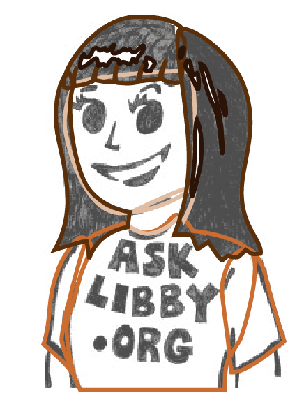
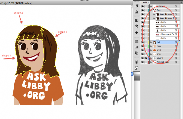
Tip: Make good use of layers to separate certain regions of your drawing (for example: hair, face, shirt, etc).
Tip 2: Avoid making single shapes for big parts of the drawing. For instance, I used three separate shapes for Libby’s hair. This will help in the future when adding gradients.
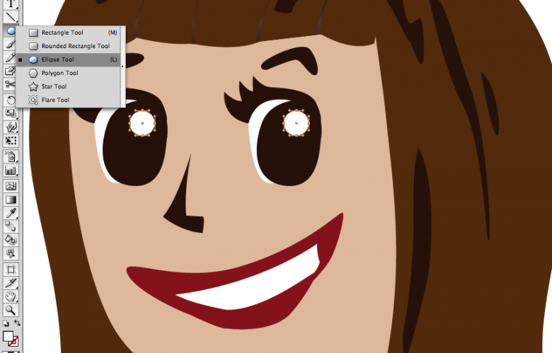
3. For symmetrical shapes like circles or squares, be sure to use the elliptical or rectangle tools to make them as precise as possible. For Libby, I didn’t use the elliptical tool for her pupils, but I did use it for the eye shines, which I added to the illustration after tracing everything.
USING SWATCHES
This next step will help make adding gradients much easier for you.
1. Choose your basic colors: I chose orange for her shirt, dark brown for her hair, and a light cream color for her skin.
2. Make sure swatches is open (window>swatches) and drag your colors one by one to your swatches. This will give you a color palette for later.
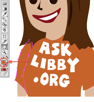
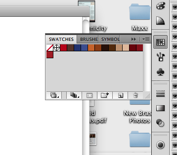
3. Now pick colors for your gradients. First start with your base color, than make it darker (or lighter). Notice the different shades in my swatches.
4. Once you’ve done that, drag that to the swatches like you did for the base colors.
Now your color palette is ready.
ADDING GRADIENTS TO ADD DEPTH
Adding gradients is an easy way to depth to your illustration. It makes the shadows and contours of your shapes pop out without being too drastic. It can be found in window>gradients. It can also be easily opened underneath the color picker.
For this example, we’re going to do Libby’s hair.
1. Highlight the piece you want to fill with a gradient (in this case, Libby’s bangs). Then, click the gradient button on the left.
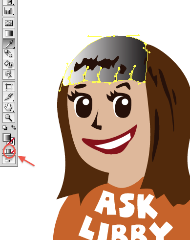
Normally in Illustrator, this takes your shape and automatically makes it in a black/white gradient. And usually, it’ll be on the black/white setting.
2. To change the gradient color setting to RGB, click on the gradient toolbox, and double-clicking one of the mini boxes underneath the gradient.
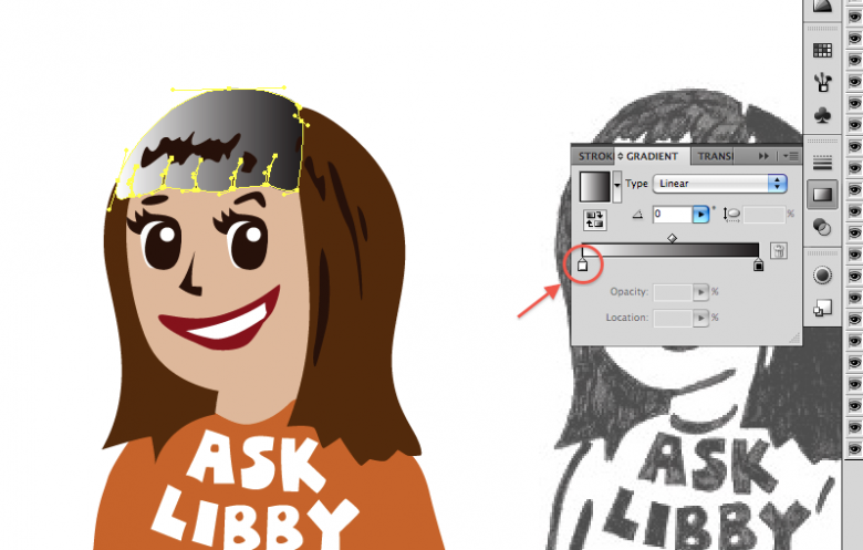
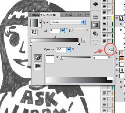
2a. In the dropdown menu in the right corner, click RGB.
2b. Click out to exit this menu and do the same for the other box to make sure it’s on RGB setting too.
3. Now that your settings are in order, double click one of the boxes underneath the gradient again, doesnt really matter which right now. This will open up your color palette. If your palette is not showing, click the swatches button on the left.
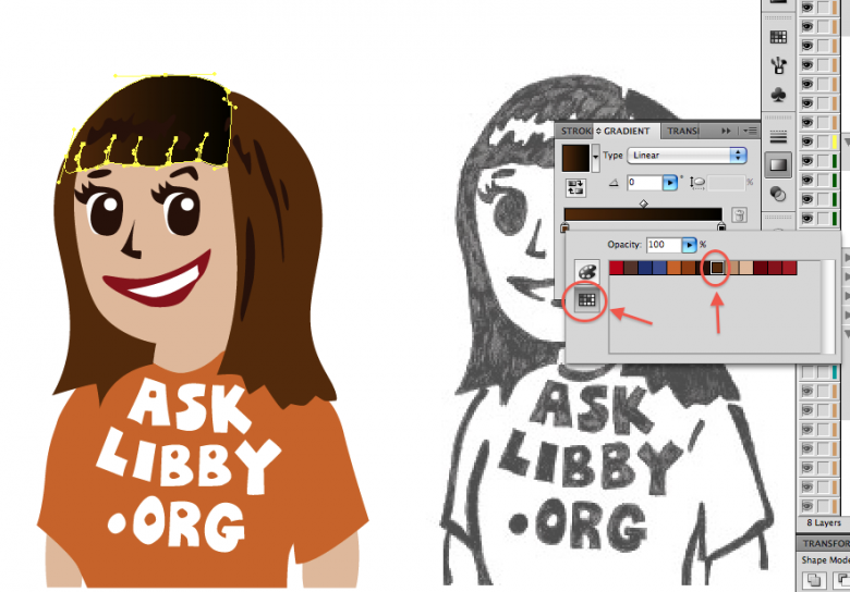
4. Choose your color from your color palette. In this case, it’ll be dark brown for the base color of Libby’s hair. After that’s done, exit that menu by clicking out of it.
5. Now click the other box on the gradient. This will be for the shadows of Libby’s hair. Using the same steps used for the base color, choose the shadow color (even darker brown).
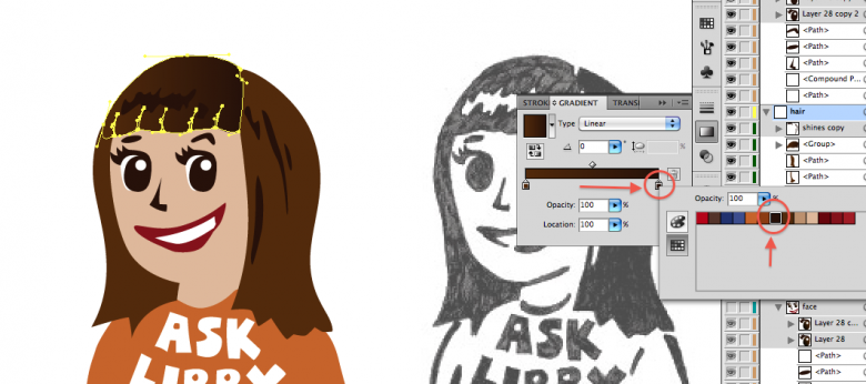
Libby’s bangs don’t go from just dark to light; it’s goes from dark to light and back to dark. So
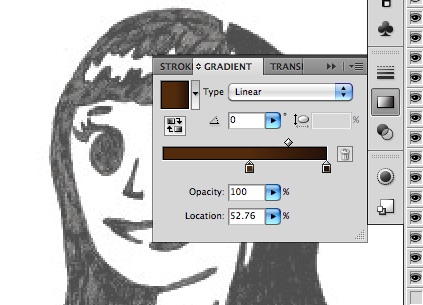
6. To add one more gradient, click on the gradient scale. This will add another box that you can fill. Do this for the other dark side of the hair. You can move the colors around so that it’s in the right order.
Here, Ive moved the lighter gradient towards the middle to make room for the third color.
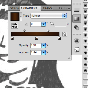
Now Ive added the third color.
ADJUSTING YOUR GRADIENTS
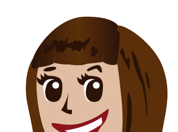
Libby’s bangs’ highlights are horizontal, not vertical. (Notice how awkward that looks) So fix this by changing the angle.
Use the dropdown angle menu in the gradients toolbox. You can change it by either entering a number between -180 and 180 or by sliding the triangle left/right. Its usually easier just to use the slider at first.
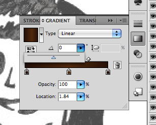
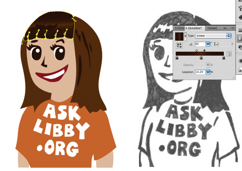
Now the highlight runs at the right angle.
Tip: Another way to adjust your gradients are the diamonds above the gradient scale. This adjusts how the gradient transitions: it can either be a gradual change or an abrupt one. Feel free to mess with it and find out what looks best.
Now that you know how to add and adjust gradients, you can apply this to all your other shapes (tshirt, face). Keep in mind it’s not necessary to do it for every single shape (I didn’t use it for Libby’s hair shines or her teeth)
Tip: be mindful of where your layers are. Make sure your detail shapes aren’t covered by bigger shapes on top of them. Adjust the order of your layers to suit your illustration.
SPECIFIC TIPS: HANDS
Hands are a pain in the butt. Here’s one way of illustrating them in Libby’s style.

Find a reference picture for a hand. Drawings in this case won’t really do. Find a good reference picture that has the same shape and position as the one you want. Skin tone doesn’t matter at this point cause you’ll just be using your color palette.
For this example, I’m going to use a picture I found through google of someone doing the Hook ‘Em Horns signal. (I adjusted the angle to suit Libbys hands)
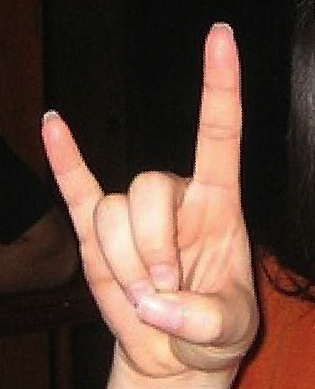
1. Start by making shapes for the fingers. Do NOT make only one shape per finger. Instead, do one shape per joint. This will give the fingers more depth and will make them look more natural.
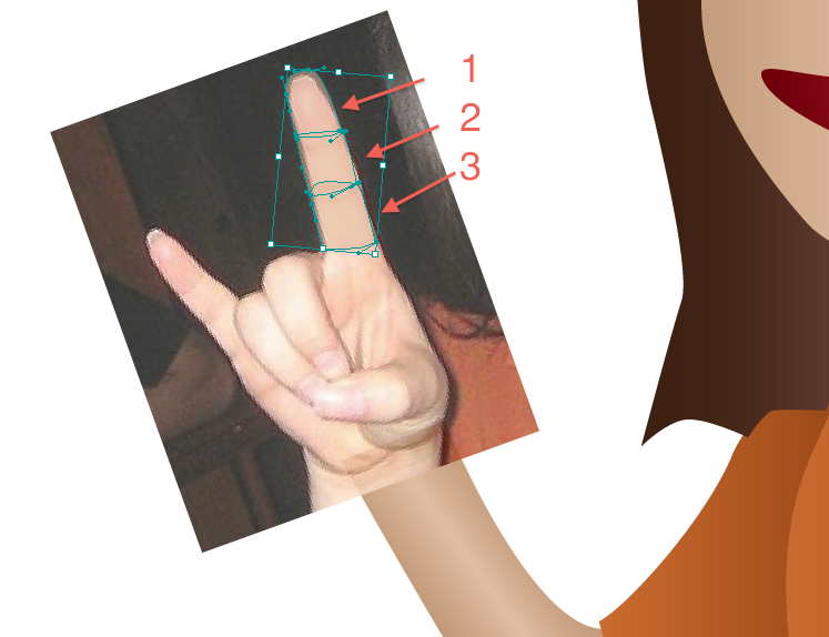
Ive turned the opacity down on the finger pieces to show the shapes and how they match up with the reference picture.
Tip: Layers. Layers. Layers. You will have a lot of shapes for the hand alone so be sure to make and label your layers (one layer for pinky, one for thumb, another for pointer finger etc).
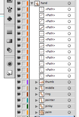
Once youre done doing that for all the parts of the hand, youll have something looking like this:
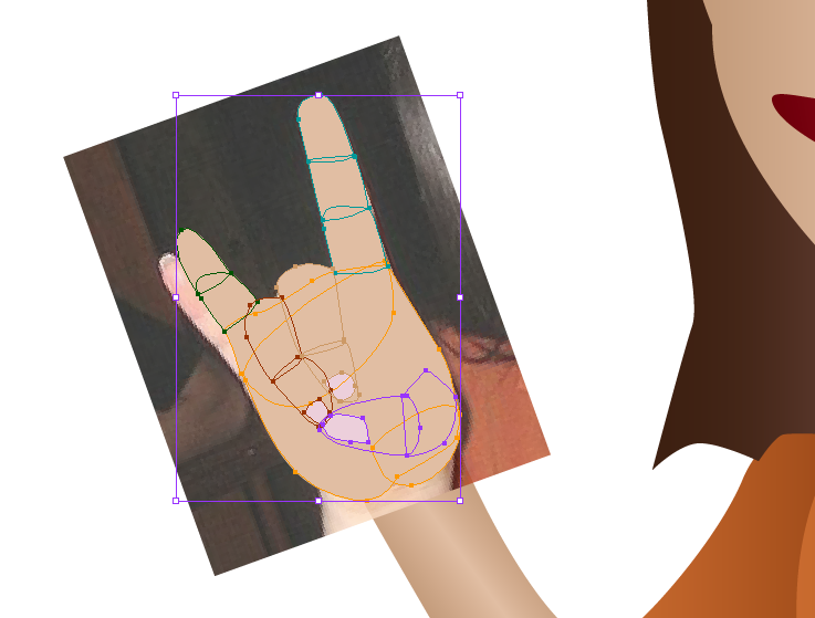
I even added the nails. Ignore the fact that her pinky and the reference pinky dont line up.
Now its time to add the gradients just like we did with Libbys bangs.
2. Using the same colors you used for the skin, add gradients to all the different shapes of the hands. Take your time with each shape and make sure the gradient angles are correct. It’s a bit painstaking to do this for every shape, but the outcome is worth it.
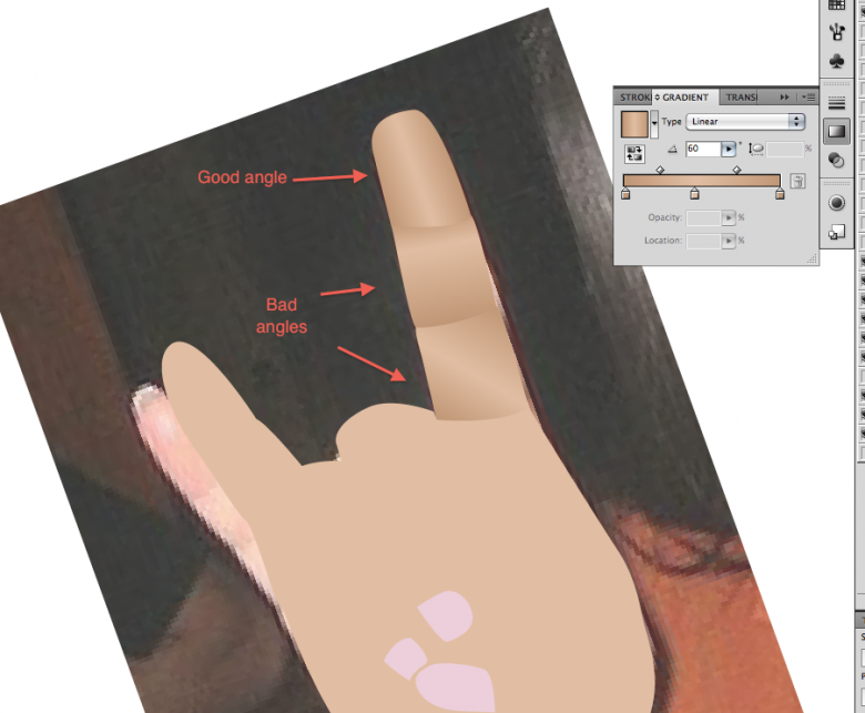
Here are examples or good and bad gradient angles and how they effect the hand as a whole.
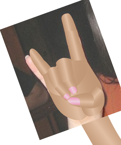
Heres how it looks after all the shapes have had gradients added to them.
3. For one final touch for the hands, add lines to accent the knuckles and/or joints. Avoid making lines with the pen tool with a single stroke and leaving it at that. Instead, make a closed shape and fill it in with a solid color.
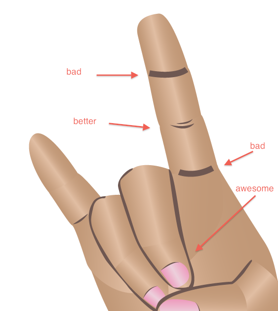
I also added accent lines for the nails.
4. Adjust and touch up the hands; this usually means making sure the gradients line up properly and figuring out where to add outlines. Zoom out every once in a while to make sure it looks good at a distance. Sometimes you have to make the hands smaller or bigger dependent on the style of the cartoon. In Libby’s case, she’s got pretty big hands in proportion to her body. But it looks good.
Then you’re done!
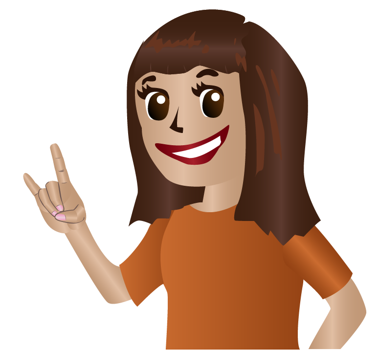 Hook ’em!