Department of History: DACA Panel Poster
The Design
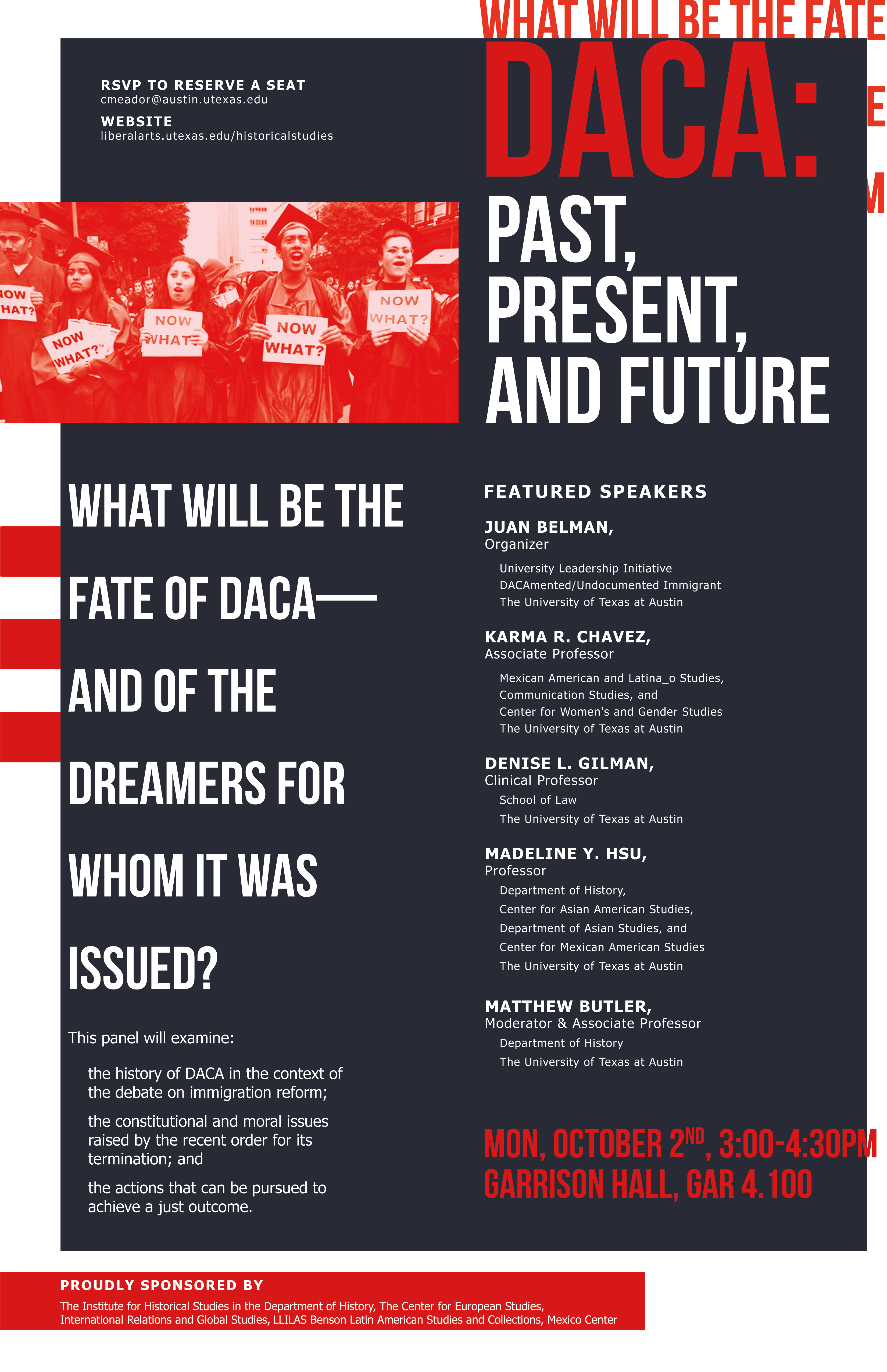
I used Bebas Neue and Tahoma Bold+Regular. For my color palette, I juxtaposed a bright, saturated red against a less saturated bluish-purple. Since the image looked kind of choppy, I used the gaussian blur filter to make it look smoother and then applied a gradient map. Poster v1a (top-left) has a purple-to-red map whereas v1b (top-right) has a red-to-red map.
Potential Issues
Disregard poster v3. I decided to include it in this post, but I don’t think it’s a viable design: it has too many scattered elements and almost no information hierarchy. It’s also incomplete (the panel info and the date aren’t placed intentionally).
– The bottom two posters have a white background, which is not visible on this WordPress site.
– Posters v1a and v1b (the top two) may need to be color corrected–they turned out a lot darker when exported than when I opened them up in Photoshop. Will look into this later.
– I didn’t include bleeds…should I?
I may or may not make another version without Tahoma, perhaps replacing it with Futura, or using Didot for a sans-serif version.