STA Presentation Website
Start: April 8, 2024
To be Completed by: April 17, 2024
Staff Guidance: Thang, De’sha, & Mike
Client: LAITS
Description: With the LAITS Presentation coming up, the LAITS department wanted to update the website where the live feed will be broadcasted. Along with some changes to the information, the client also wanted a new design that aligned with current assets.
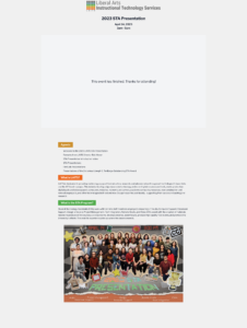
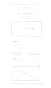
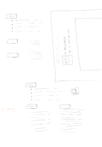
I started out by looking at the previous year’s design along with other websites they provided and making low fidelity sketches of the structure.
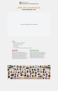
Then, I created the first iteration with the edits the client wanted to add to the informational paragraphs. I also tried out different title designs and modes of organizing the different pieces of information.
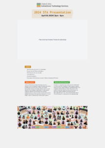
However, after talking with Thang about the level of freedom and creativity I was given, I decided to incorporate elements from other assets for the 2024 STA Presentation. I wanted the design to look cohesive overall so I decided to use the ticket images that are included in the photo underneath the information and goes along with the STA Presentation theme.
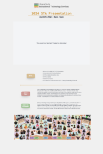
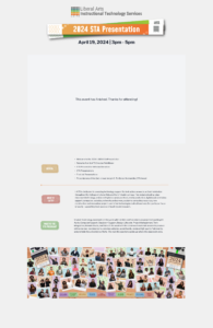
Though I liked the idea of using the tickets for the subheadings, I wanted to incorporate them in a different manner. So, I sketched out different ways to incorporate them leading me to the next design with one ticket per subheading and the information stacked instead of it being a two column arrangement. I added a line to create some sort of separation between the agenda and the rest of the information.
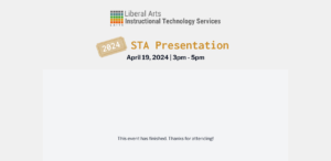
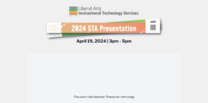
I then focused on the title to incorporate the same design style where the title would garner attention but still kept and overall simple design. I tried using two different objects, the tickets and the wristbands, all previously used in another deliverable STA Presentation asset.
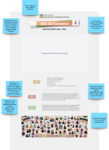
I decide to go with the wristbands and with the new iteration I added notes around it.
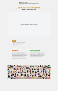
After a quick feedback session, I made all the information be left aligned and the wristbands a higher vibrancy to maintain a cohesive design.
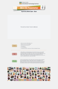
Once I submitted the first official draft, I made the following edits to create the last iteration:
- Changed the subheading’s font color to a darker corresponding ticket color
- Increased the text size for the “AGENDA” ticket
- Resized all the tickets so they all had the same dimensions and fixed the alignment
