STA Training: Logo Design
Start: Sep 27th, 2023
To be Completed: N/A
Description: This is a three-part training in branding and the first step is the creation of a logo to represent myself.
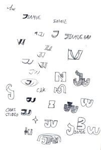
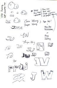
When I looked back to my portfolio site, I realized that most of my personal work in done in black and off-white with thin like and heavy text. Therefore, I’d like to make a monogram logo in a minimalism style. Here are some sketches with the combination of my initial: J & W. I realized that they can combine with each other by overlaying J and the left part of W.
Version 1 in illustrator
My logo meant to be abstract to showcase the aesthetics of my design work. However, I’m not sure if I want to go with an elegant and thin style or the strong stroke. The strong strike is bad in readability but create interesting negative space for me to input more design inside. That’s how I come up with my new versions.
Version 2 in illustrator
While De’sha pointed out that it’s hard to read J&W with the shape, I realized that I could emphasize my name inside the strokes. It’s especially useful when I put it in the business card or personal website.
Next Step
When I looked at more examples in self-branding, I saw a couple of designers use a branding kit to represent themselves instead of a single logo to deal with different scenario. I think this logo would be a good supplement on this kits rather than itself to represent “the whole me”. For next steps, I would work on another form of logotype following the similar aesthetics of this logotype.


