The Precursors
Start: Feb 13th 2023
To be Completed: End of March
Client: Celeste Henery
Staff Guidance: Maddy
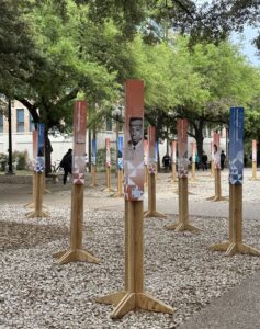
Description: Commemorate the first black student to enter UT after integration in the East Mall and build a physical exhibition for the groups of Precursors from 1956. The physical exhibition is directed by the MASS agency and they create 118 total markers with each precursor’s name and the QR code of each individual person. Our task is to design an interface that prioritizes the mobile experience that would pop up after the audience scan the QR code on the markers.
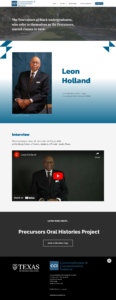
Individual Page Example:
Prototype for Mobile: https://www.figma.com/proto/kZw0Du9wtfAT3Z3pfKfyp0/Precursor?node-id=5%3A121&scaling=scale-down&page-id=0%3A1
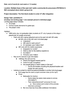
I’m assigned to mockup one landing page + one example person’s individual page. I started to work on the example individual page with a short description of the project, the precursor’s name, portrait, and an interview with them. I create two versions for this page: one is vertical and another one is experimental with the horizontal format.
With the previous design, I found:
- The design could take inspiration from the existing graphics of markers
- The “LEARN MORE” section can be direct to the main page directly without further iteration or explanation.
- The banner would be similar to the main page if it occupies the whole page.
- The bigger typo on the precursor’s name is more informative and optimal for the mobile experience.
- Lager negative space can provide a break for reading.
Landing Page:
The landing page contains the project name, project description (text and video), and the list of precursors from 1956.
What I alter for the second version:
- Break the long text box into several paragraph ad prioritize part of them due to font weight, font size, or color
- Give more information on the first block to grab eyes
Desktop Version:
For the desktop version, I need to remain the same design elements for the desktop but refine it with padding and size.
Prototype for Desktop: https://www.figma.com/proto/c5jamJIdmhoEMbZWeqrERS/The-Precursor_Desktop?node-id=4%3A2&scaling=scale-down&page-id=0%3A1
Update on March 6th:
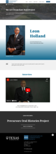
Celeste and Maddy gave me several useful feedback on the website I made:
- create a separate page for people who don’t have professional photos
- Added a title to the page
- Omitted the visual decoration. Just the gradient adds a nice simplicity & tie-back to the markers.
- Add a Quote to each individual page
- Unify the front-style library to match the WordPress existing page.
Final Prototype
Update on March 8th:
A little bit of re-design on some elements and clean up with the text.
- Enlarge the quote and remove the gray block to keep it clean and engage.
- Remove the fully-expanded dark-grey block for the “Learn More” block since it creates confusion with the button banner.
Thanks Maddy to implement my final design into the website. Now the physical exhibition is held on the East Mall and each precursor has their page now.
If the audience scan the QR code, it would direct them to everyone’s individual page. If they’re interested in more people, they can go back to the main page by the shortcut we created to browse more stories.


