Value Institute Brochure
Thursday Update
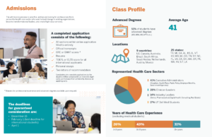
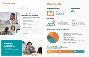
This week, I moved forward on the Class Profile page. It’s my favorite page so far! I love the graphic elements and the colors. It’s really incredible to look back and see how far the brochure has come. We’re nearing the last two weeks of editing before the deadline, and I’m so excited to see how it will look at the end.
Tuesday Update
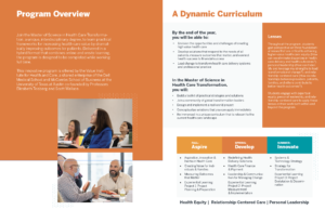
This week, I mainly focused on the cover and first spread. I designed a graphic based on a previous graphic from the Value Institute, making some aesthetic and functional changes. Because the client wanted a recreation of this specific graphic format, I had to shift around the layout. Here is the result:
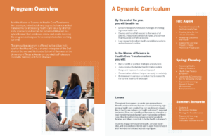
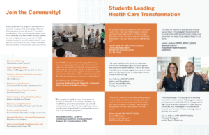
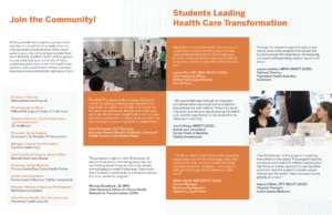
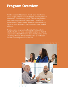
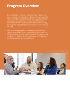
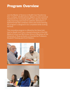
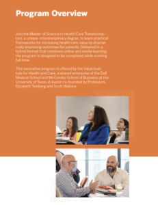
I’m also working through iterations for the first page. The client feedback was that there was too much blank space. Here are a few options for the layout.
That’s it for this week!

