Week XL
Another slow week, assorted small tasks.
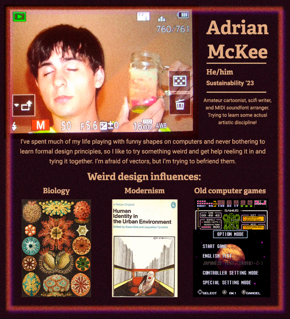
STA Bio
I don’t have much to say on this, a self-explanatory fun assignment, but I guess this cements the fact that a grainy noise texture is one of my trademarks now. It just makes everything feel so much more earthy and retro! Like it’s flickering on a vintage monitor or printed on a cheap zine.
HIS 315L – The United States Since 1865
Just a simple text update again, though I spent most of it on a scavenger hunt for the editables. Turns out they were embedded in the Basecamp comments, not any of the Box links also found in the Basecamp comments. Another reminder to please keep your files organized!
Health Transformation Research Institute Statistical Literacy – RAZ
We’re still in the pregame phase, but we’re doing some planning for the powerpoints and some assigned reading:
https://www.brightcarbon.com/blog/presentation-design-principles-better-powerpoint-design/
Notes from the discussion:
- The ways to break up bullet points into grids and dividing lines were most interesting. However, I feel like it will be hard to predict what we can do for RAZ until we know the exact volume and consistency of the slide content.
- Consistency has been an issue in the past – I’ve sunk lots of time into adapting a powerpoint format for one unique slide after another.
And some of Rachel’s:
- Depending on the kind of content Raz wants, we will probably need a style guide. If we make assets in illustrator, we can make a style guide like we did for AFR.
- A lot of clients tend to send a lot of text and want us to fit them into the slide. I’m not sure if this will be the case, but there’s been some issues where the amount of text for a specific slide doesn’t go well with the general powerpoint format. I think flexibility to divide things up into more slides may help with this
- A powerpoint template for various different slides should also probably save a lot of time, but once again sometimes it can still be tedious if specific slides don’t fit the template
- Images are sometimes sent that are not the same aspect ratio but need to be on the same slide – depending on this particular content, we can probably find a work around or ask for a replacement
Intermediate Training: Brochures
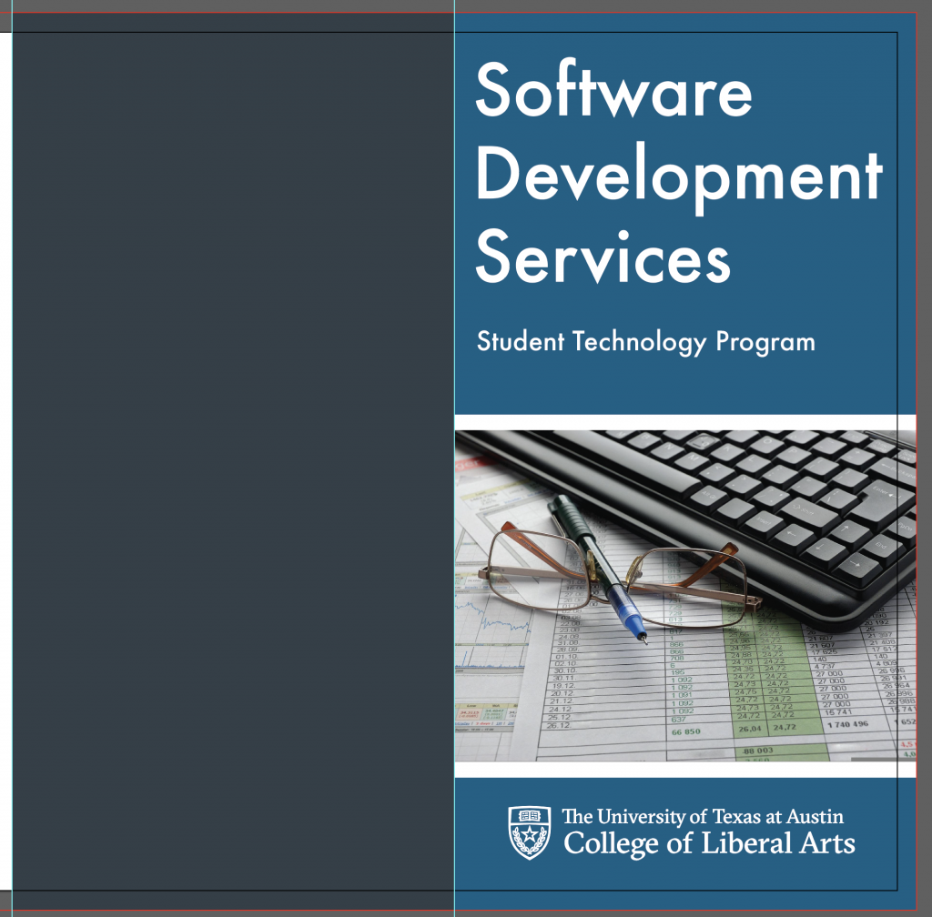
So long, InDesign! I’m back to Illustrator for this one. The training itself is very straightforward, with few hints as to the anatomy of a brochure, so I started simple.
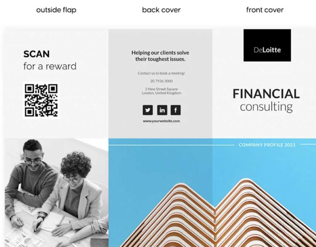
However, I found myself wondering what the heck does go on the back of a brochure, and in reading some google results, I decided to try and copy a sleeker format found in one example.
I’m sticking to the futura, and faded palette, but I’m not entirely sure how to balance everything visually. This one will take a lot of fiddling, but it’s a skill I need to get better at.
