Training: Photo IDs
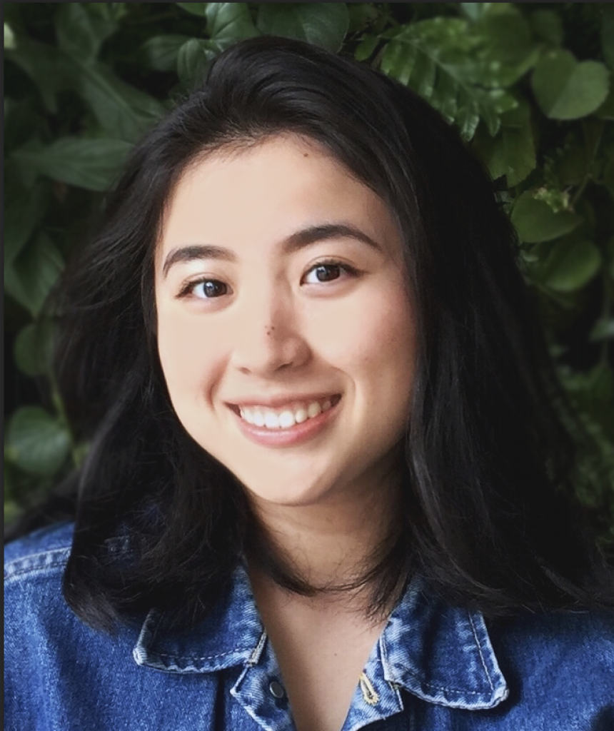
Assignment: Take sets of example photos and edit them to fit the LAITS quality guidelines
The important thing for these images is for them to be:
- Neutral colored (not too warm or too cold)
- Good, flat lighting
- Medium or slightly-heightened contrast (higher contrast can appear more professional and attractive)
- Framed in a visually understandable and appealing manner
There are three photo sets: easy, medium, and hard.
I…accidentally did all four for easy. I will showcase here the two that came out the best.
Easy:
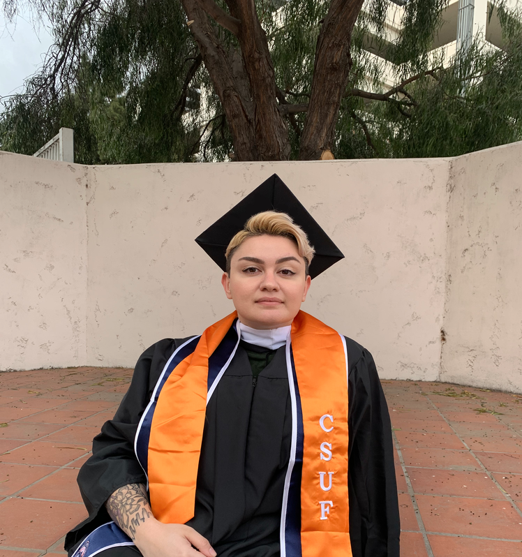
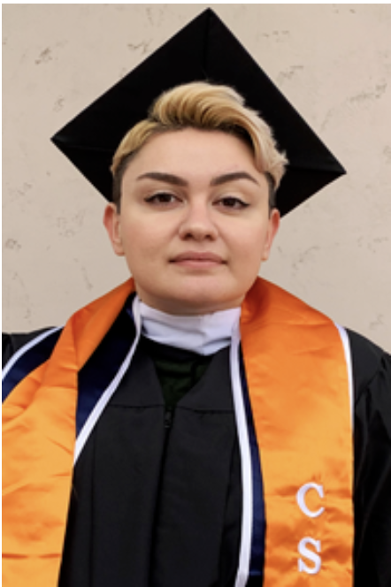
Original
Edited: Higher contrast, cropped for LAITS
Original
Edited: Cropped, lighting slightly fixed
Medium:
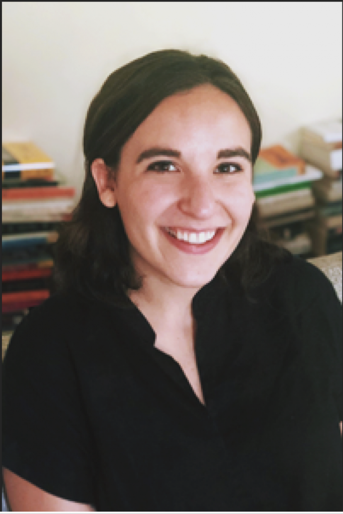
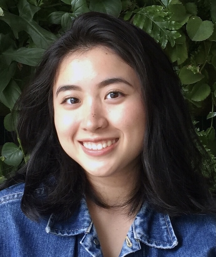
Original
Edited: Fixed cool tone, higher contrast, edited exposure slightly to reduce blending between shirt and hair, cropped
Original
Edited: Fixed warm sepia tone, contrast, cropped, increased exposure as image was too dark
Difficult:
Original
Edited: exposure, color, contrast, + used blur and brush tools to lower severity of highlights until her skin looked more even, used multiply layers, cropped
This was certainly the most difficult of all of them, but was quite fun to do.
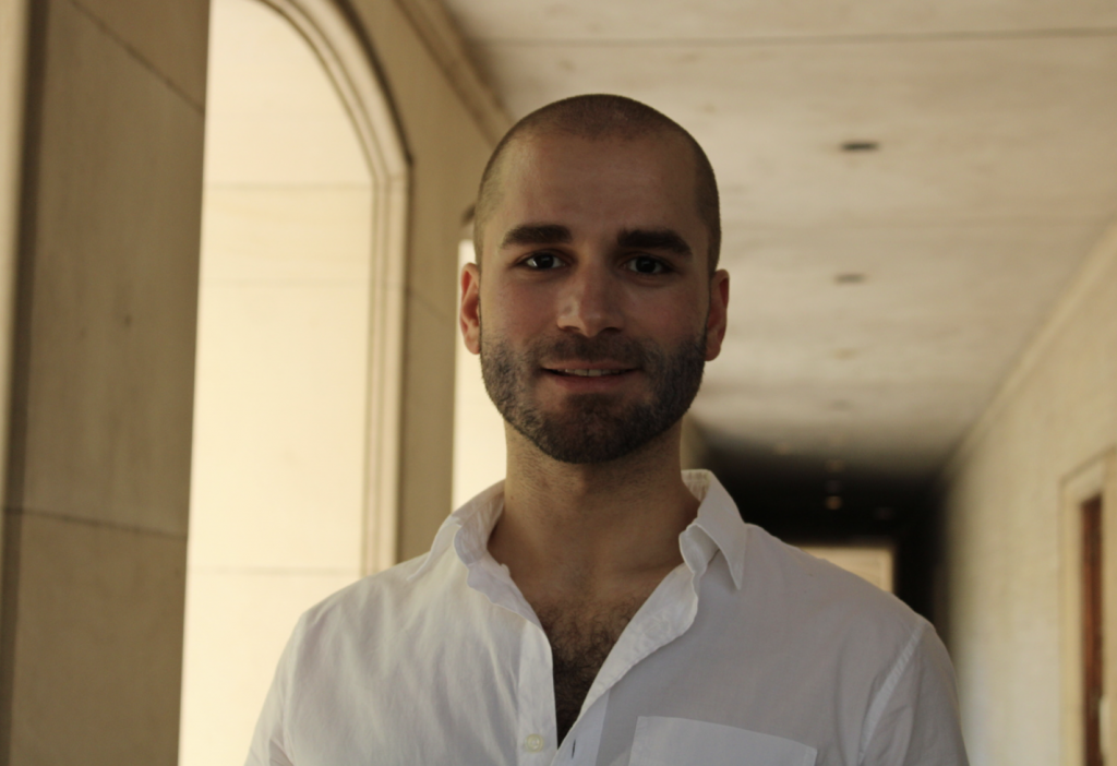
Original
Edited: exposure, lighting, contrast, air-brushed his face to have the lighting more even
This is the non-cropped version. I wanted to share this to show how the door is over-exposed now, but his face is not. If this were in a real ID, you wouldn’t see anything past the first pillar to his left, and the image would work much better over-exposed than under-exposed.
General What-I-Learned:
- The best colors and contrast levels to use for LAITS photos
- LAITS cropping and sizing guidelines
- How to artificially light or darken areas of the face to get a more even lighting
- Blurring out background elements for the sake of the face standing out more
- How to use the curves and levels tool to alter gamma and exposure
- What mid-tones need to be toned down for the sake of having a more neutral color palette in the image.


