Project: AFR303 Intro to Black Studies
Client /Prof: Dr. Gordon, Dr.Colón
completion status: completed
staff guidance/team: Maddy, Abriella, and Rachel
description/plans: redesign graphics for presentation following the style guide
To be completed: Ongoing semester project!
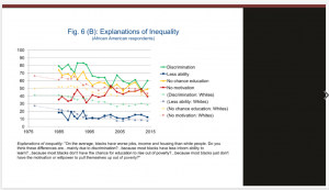
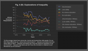
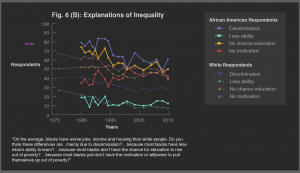
Explanation of Inequality graph:
My first draft used dashed lines and empty squares as data points, which looked busy and kind of overwhelming. Abriella and Maddy suggested solid lines and solid data points, and the final result looks like this:
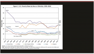
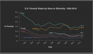
Poverty rates graph:
For my first draft, I decided to leave the labels in the graph for easier access, after discussing with Abriella and Rachel we decided that we should keep it consistent with our other graphics by taking the labels out and add a key.
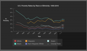
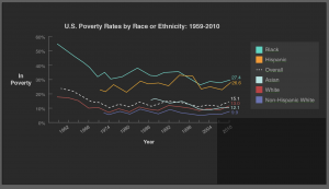
Second iteration, I added a key to the bottom of the page, Maddy suggested to put the key on the right of the graph and organize it by the order each line appears.
Final graph:
