TOWER Tools: Course Graphics
Hi y’all, happy Monday! I’m usually more of a Friday blogger myself, but this past Friday was the STA Welcome Back Party, and I didn’t have time to do it. But I had a lot of fun at the party though… Anyway, back to work…
Project: Course Graphics for TOWER Tools
Client: Julianne Phillips
Completion Status: Mostly finished; buttons pending.
Staff Guidance: Maddy
STA Team Members: Cristina (the man, the myth, the legend)
Description/Plans: Create some cool new graphics for this Canvas course including: a banner, a dashboard graphic, and some buttons.
In case you don’t know what this course is about, you’re not alone, cause neither did I. But as I worked on it I came to learn that this course is an internally-developed Canvas course designed to train TAs and professors on using our custom-built TOWER tools in their classes. Apparently the course has been running without any graphics at all for a few years now, and I also I didn’t get much direction, so it was nice to have a chill project to work on. The twi requirements I was tasked to fulfill, though, were as follows:
1. Add some form of LAITS branding
2. Make it look professional but not boring
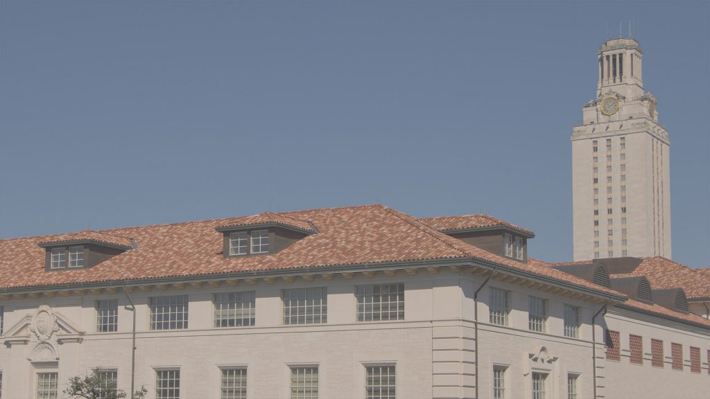
So I got down to business… They didn’t specify a style to work on, so I decided to go with Style B (background image) because I personally think it’s more engaging than Style A (solid background color). So, for the imagery I chose to work with the Spanish Tiles from our generic wall monitor’s library because it has a nice view of the UT Tower, and it just felt fitting for this project.
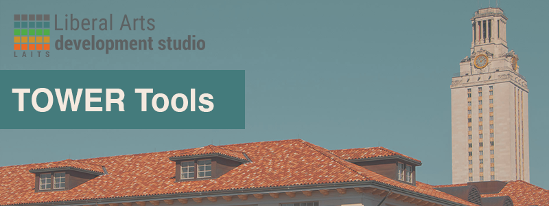
That being set, I started working on the homepage banner, added this image and played around with different colors from the LAITS color palette, to see which one would look best for the text bar. I started testing out the orange, but the image looked a bit dull in comparison to the text bar. So I added some selective color filters to the background image to make it match the LAITS color palette a bit more. I edited the color of the tiles into a brighter orange, the clock’s to a brighter yellow, and the made the blue sky is a bit more blue-green. But the orange color bar still felt a but too much, so I changed it to blue-green. Then I added the logo, and after a few rounds of feedback with Maddy regarding the size and placement of the text bar, and the ideal tone for the sky, here is the finished product:
Then I incorporated that same image into the dashboard graphic, got some feedback –you know the drill– and finalized that not much later. The only thing pending now is to make the buttons. The course is going through a bit of a redesign itself, so for now I was just asked for two buttons, with the possibility of more to come. But for now, this is what all these three graphics look like:
So, regarding this project, that’s it for now. But I’ll let you know if something else comes up with the buttons… For now, since it’s October and I’ve had this song stuck in my head all day, here’s a spooky season classic just for you:


