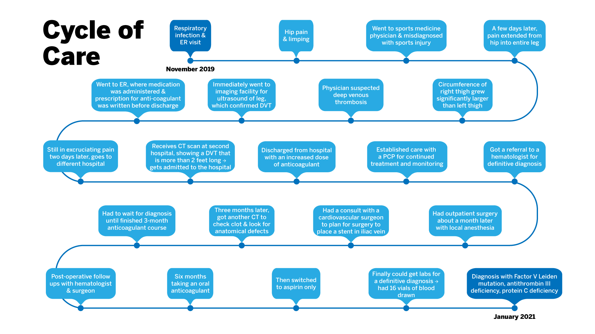
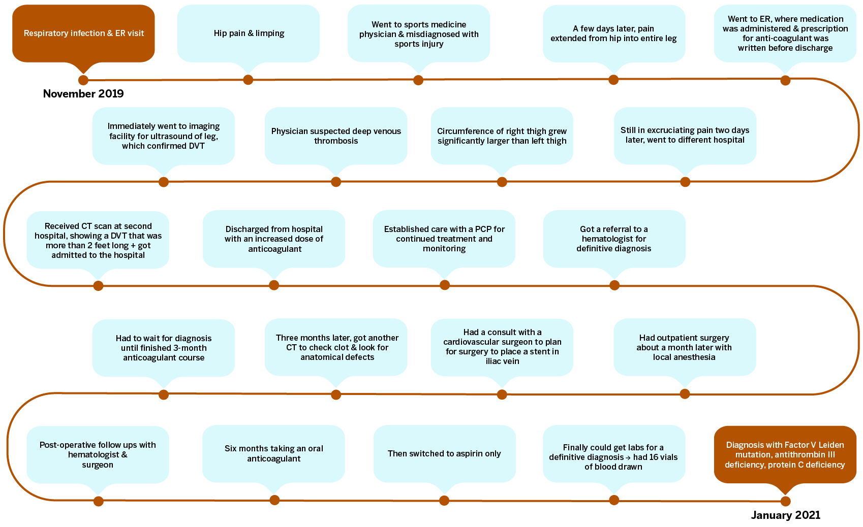
Dell Medical Flow Chart
The Dell Medical team got back to us letting us know of edits they wanted made. One was for formatting issues such as a smaller title all on one line and a spanned image in the format of an SVG so I altered my export to have no margins and titles so that in the code on the site contains those aspects instead and are easily editable. The clients also wanted burnt orange and light blue instead of the all blue flow chart. It wasn’t specified how they wanted it on the chart so after a couple of variations the light blue bubbles with burnt orange lines seemed to be the most readable and visually pleasant to look at. There was also a request for even padding within the text boxes so I formatted all text to be a paragraph with built in 10px padding all around and then lined up the text boxes to edges of the bubbles, all the bubbles were made the same size as well. The last edit which was the most difficult was that they wanted all the text bubbles and points to stack vertically but because there were 22 bubbles and we did not want 11 rows or 2 rows it was not possible for all bubbles to line up exactly. Instead I compromised on a varied stacked layout where it alternates row to row.


