Chatter: Branding/Logo Drafts
🎶 It’s the most wonderful time of the year 🎶 🎄
As someone who hasn’t seen her family for the past eleven months, I am very excited to finally be back home for the holidays and so happy to get more into this season’s spirit. Anyways, enough about me.
This activity was a continuation of the past one I blogged about. From the 11 ideas I suggested, I was told that #9 was a clever idea because “campus squirrels + squirrels make chatter sounds = genius”, Thereupon, based on the idea I suggested during my brainstorming to incorporate UT’s squirrels into the new branding, for this task I was instructed to design a draft for the branding/logo for Chatter.
– Just as a general reminder, Chatter is UT’s upcoming replacement for Piazza: “a course-based Q&A discussion board for students, professors, and TAs.”
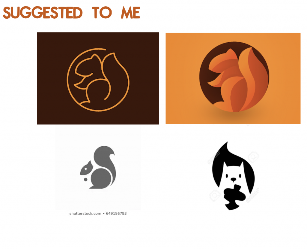
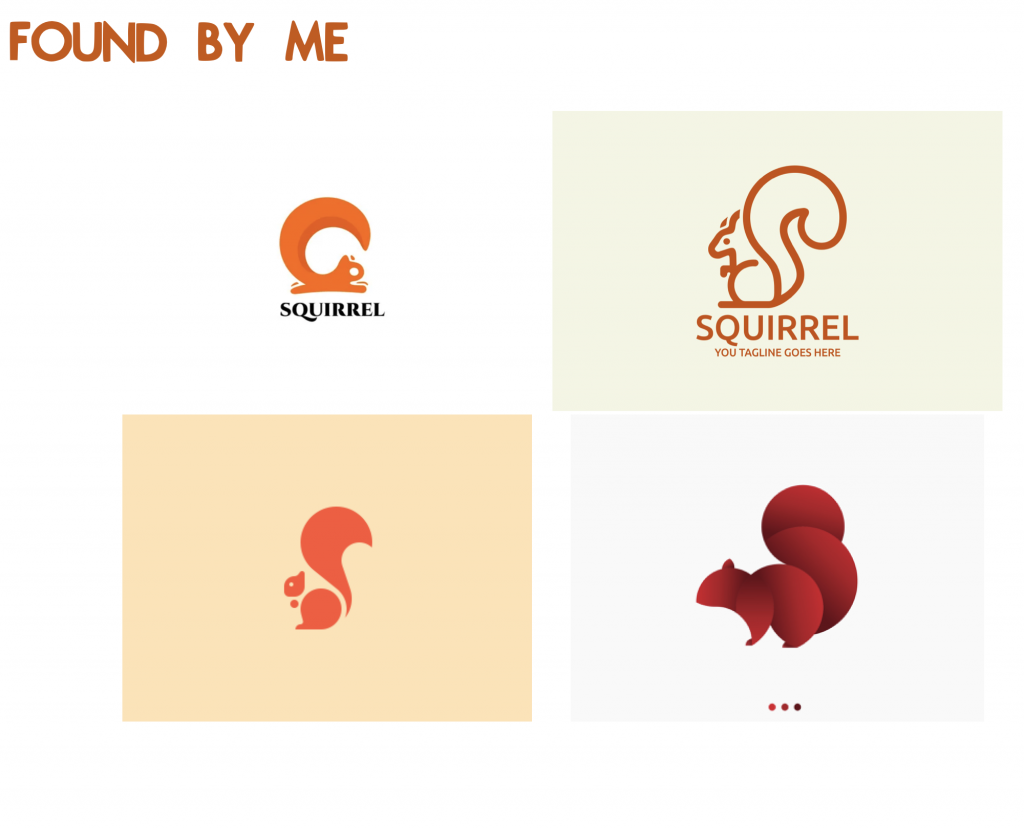
This takes us to Phase 1: Finding inspiration. At this point I was asked to look for inspiration from preexisting squirrel logos to understand the basics of simplifying a concept into a logo.
After that came Phase 2, starting a draft of my own.
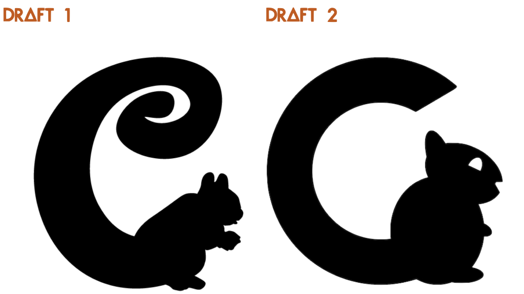
Draft 1: From one of the inspiration pics that I found, I got the idea to make the squirrel’s tale into a C for Chatter. So I incorporated that into my first draft. However, I got feedback telling me that though funky and cute, the squirrel was a bit too realistic, which is a problem with logos since they’re supposed to be able to be resized without loosing the quality of the shapes. So I was asked to draft a second version with a more geometric and simplified squirrel.
Draft 2: And so, this draft was born, where I completely changed the style of the C-tail and made the squirrel mostly out of circles. But the problem with this draft was that the shapes used to build the squirrel were a little too “on-the-nose.” I was given more feedback in a meeting about this, too.
After that draft it was decided that the idea to make the squirrel’s tale into a C should be scrapped altogether. But with more clarity, I started working on Draft 3 not long afterwards. At this time though, I was asked to share some ideas for a font to include the wordmark “Chatter” alongside the squirrel. The following were my three suggestion:
(They ended up choosing Righteous as the preferred font for this wordmark)
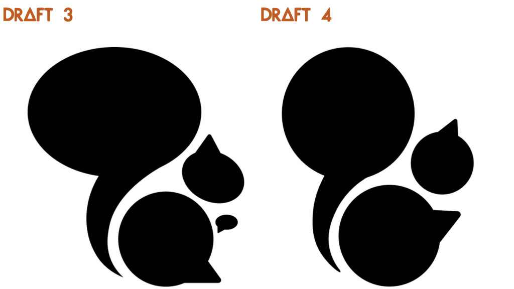
Draft 3: For this draft I had a whole new vision and ended up making a squirrel out of four speech bubbles reshaped and resized to fit the proportions of a squirrel. This idea was what worked best! So I got some final feedback to refine this idea and that takes us to draft 4…
Draft 4: The final draft! This draft is what got presented to the Chatter team along with 4 more options created by some of my peer STAs.


