Basic Training: InDesign
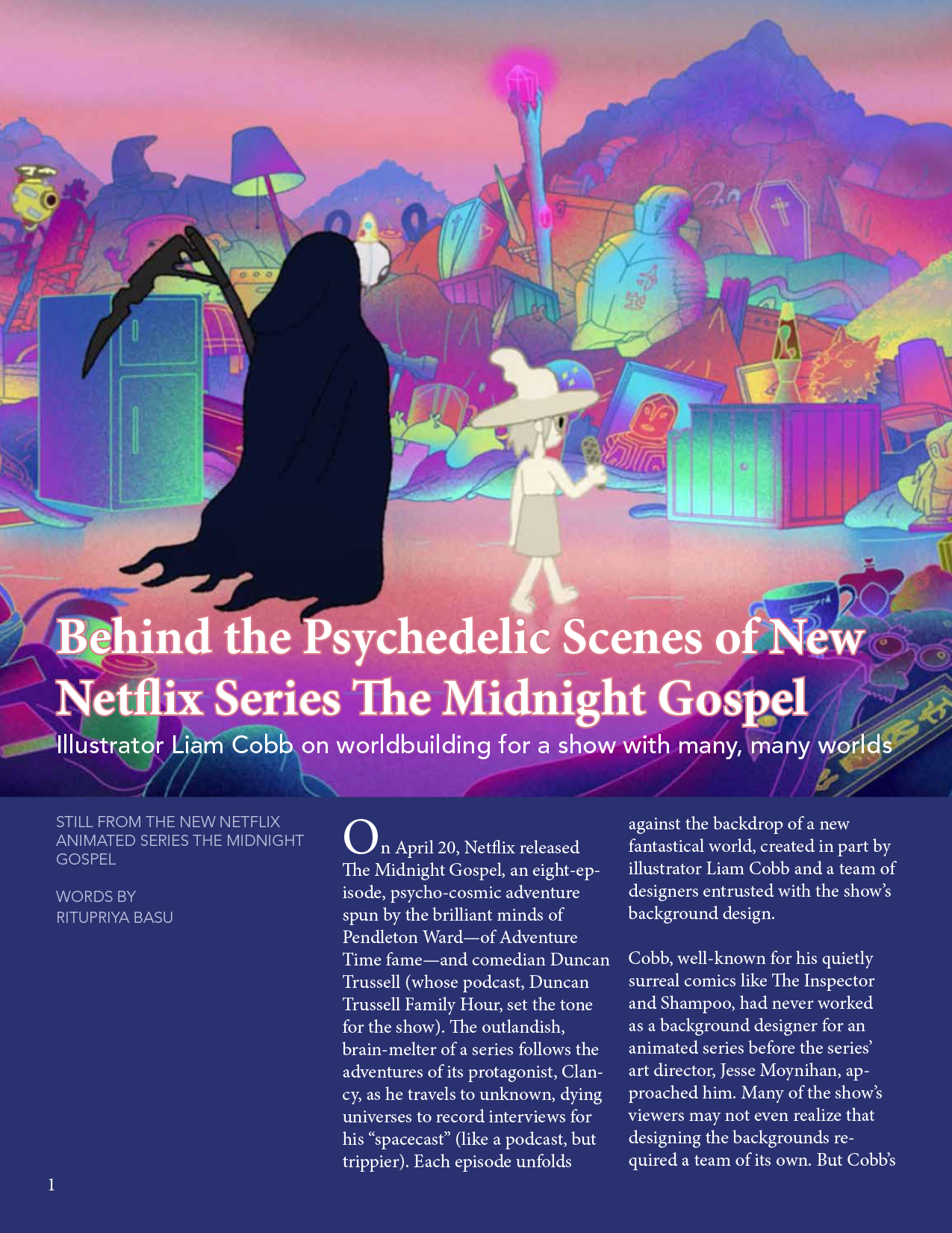
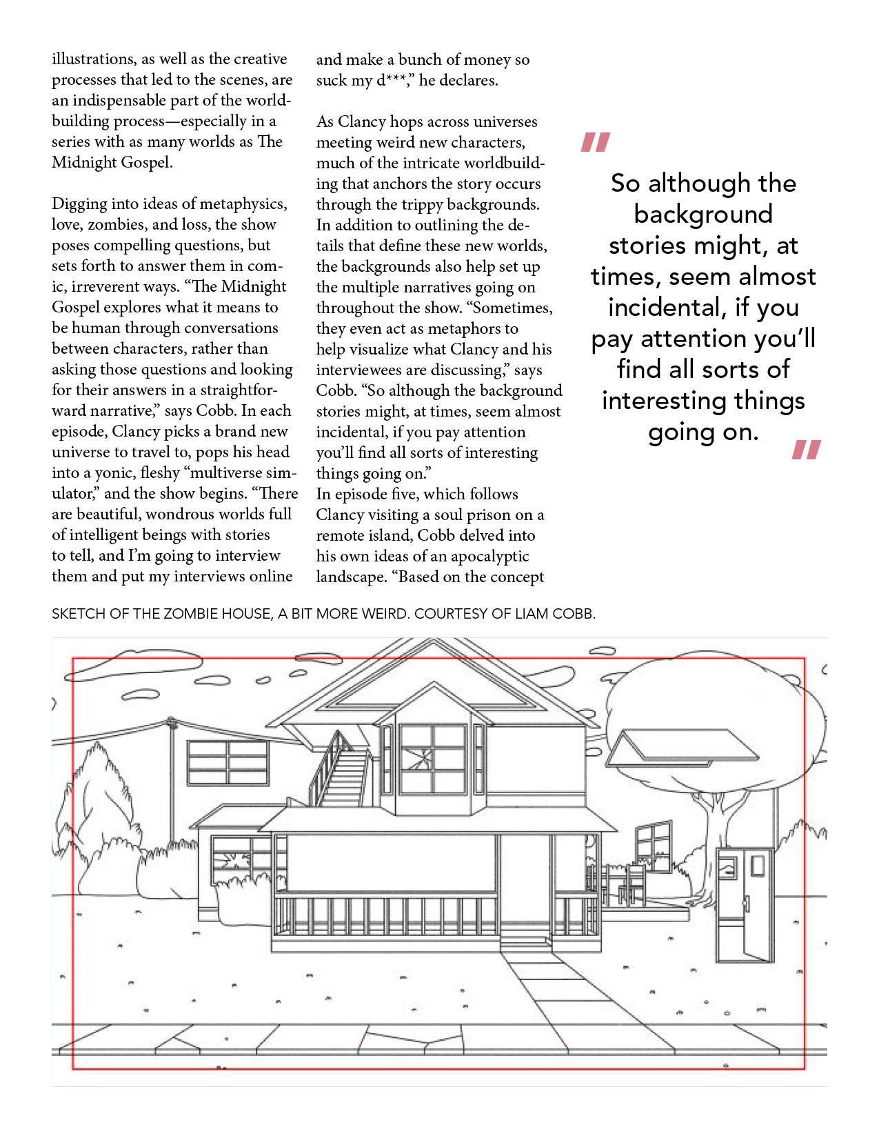
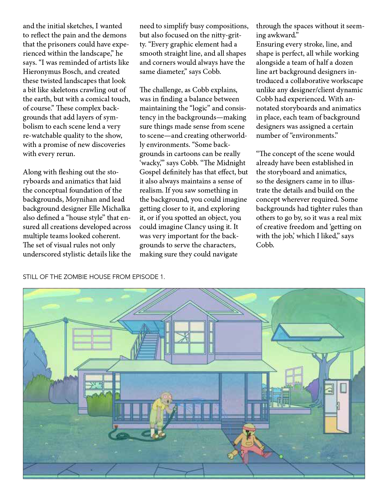
This is my first time using InDesign, so it’ll be interesting to explore this program and get familiar the process of creating magazine spreads and other types of layouts. So far the program has been pretty intuitive, and I think it’s one of those things that will be super useful to have some experience with in case I ever need to make a flyer, brochure, etc.
For this training all of the content was given to us, and so the assignment was to arrange in an aesthetic way, create different text styles for the header, paragraph content, captions, etc. I decided to make the first page more of a focal page and keep the rest more minimalist. I used accent colors (pink, dark blue, pale blue) by pulling colors directly from the feature image, which is always a good way to tie in color.
After Effects
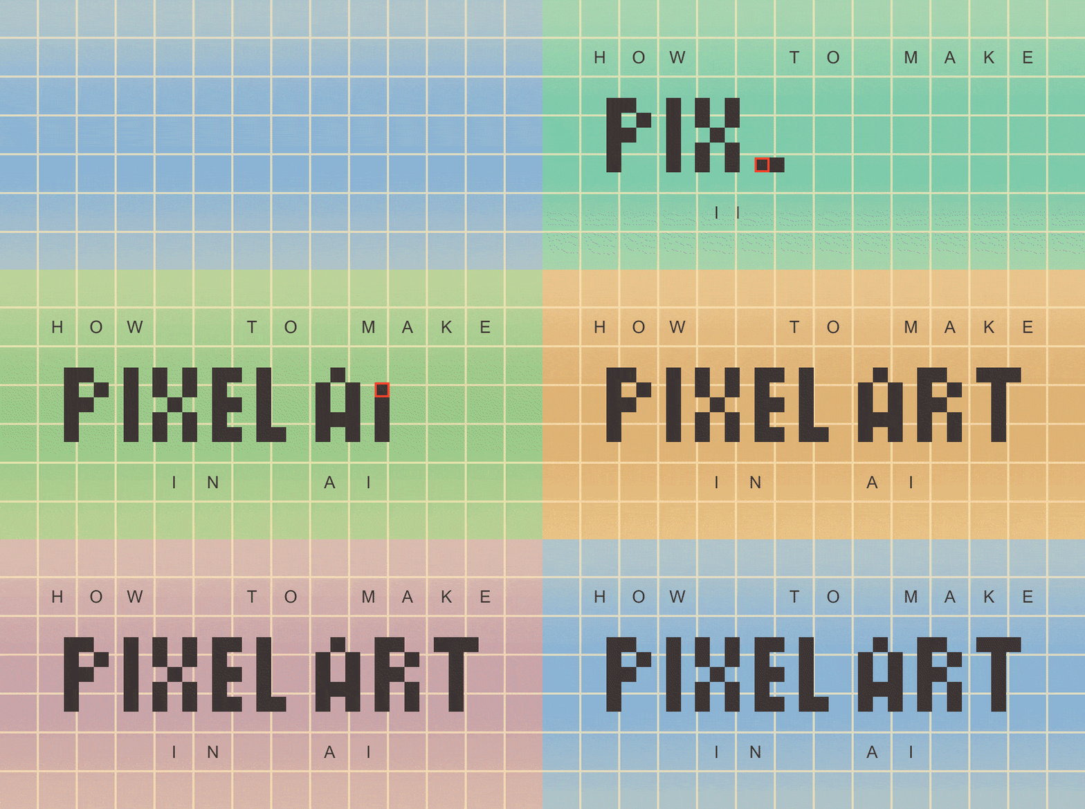
I also tinkered a little bit more with my animation to get the letters to slide in faster, because initially there were too slow I think.


