InDesign Training
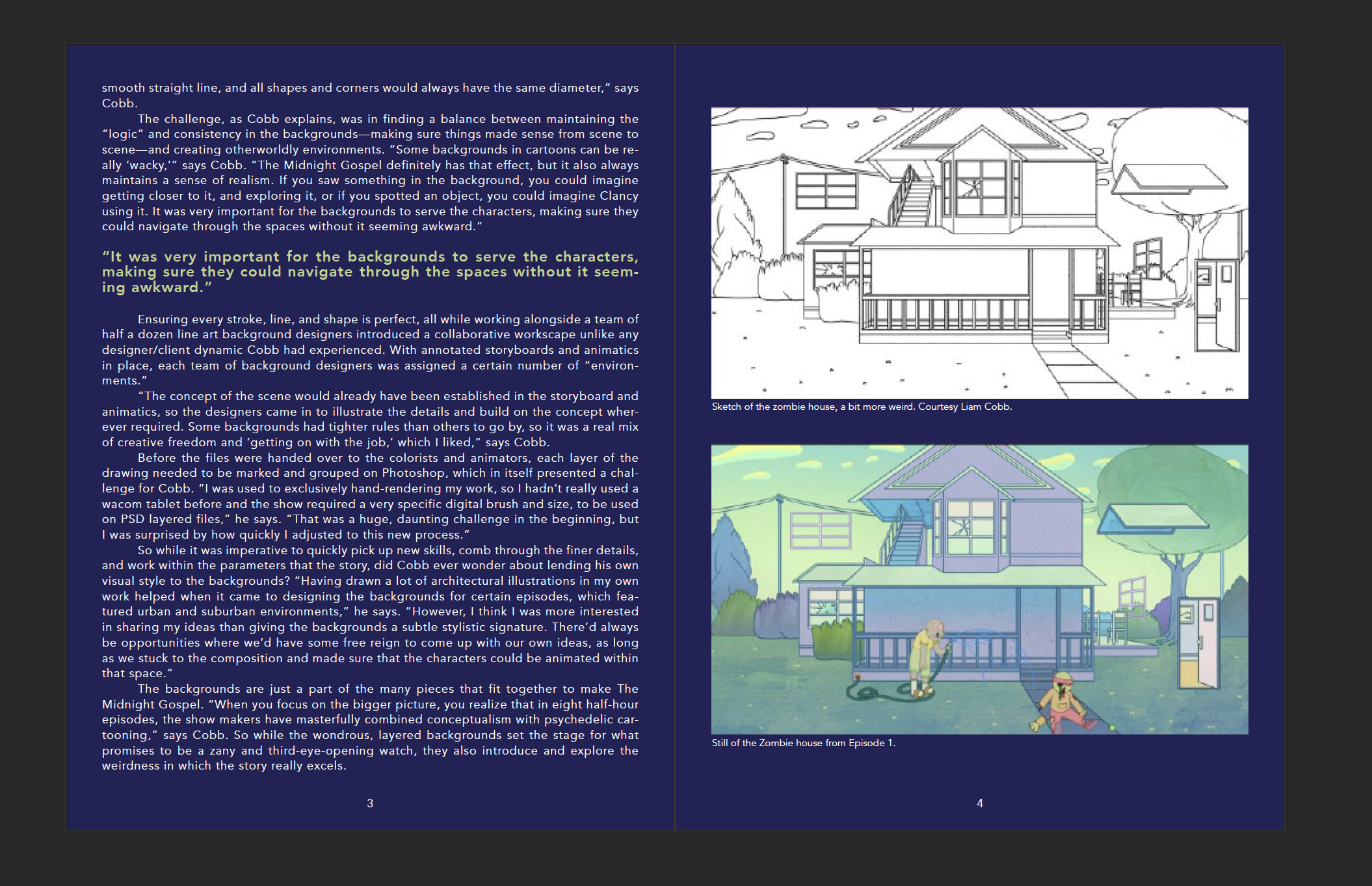
This is the layout design I went with given the text and images that were available in the training. I wanted something more straight forward that felt like a book spread more than those narrow columns. Megan suggested I adjust the tracking and leading to fill up the text to the bottom of the third page which was a great suggestion. I didn’t compromise the appearance of my text to achieve that end, so it was a beneficial trick. I hardly ever use this application, so I’m really thrilled I was given the opportunity to give it a try here at work.
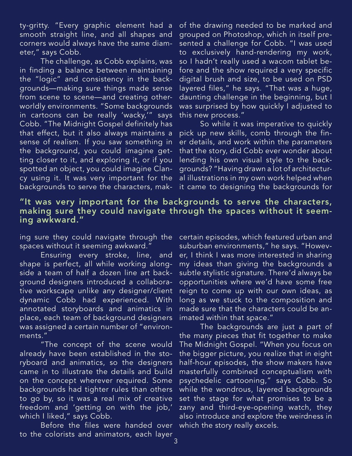
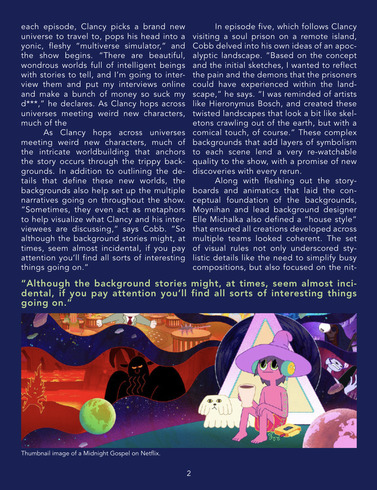
Here are updated images of two columns:


