Persian Layout
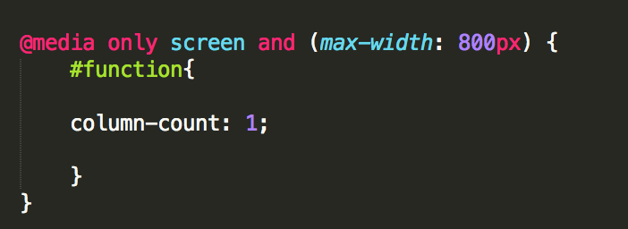
One of the biggest improvements I’ve made to the Persian site is to the layout. The first thing I did was add an @media css rule to change the number of columns based on the screen width. That looks like this in the CSS: 
basically when the screen gets to width 800px we go from 2 columns to 1 column so that things aren’t squished together.
This is how that looks in the real world: