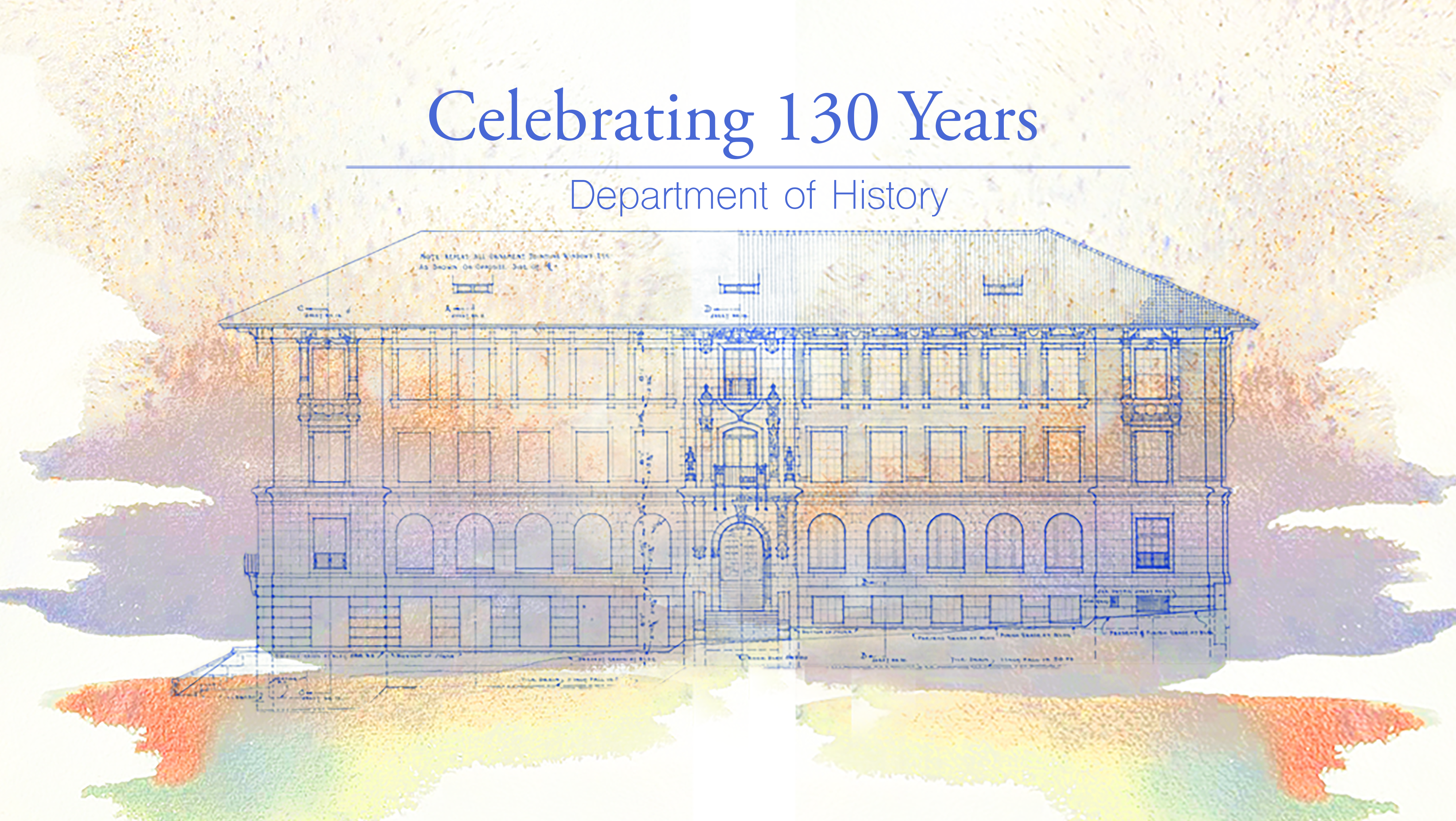
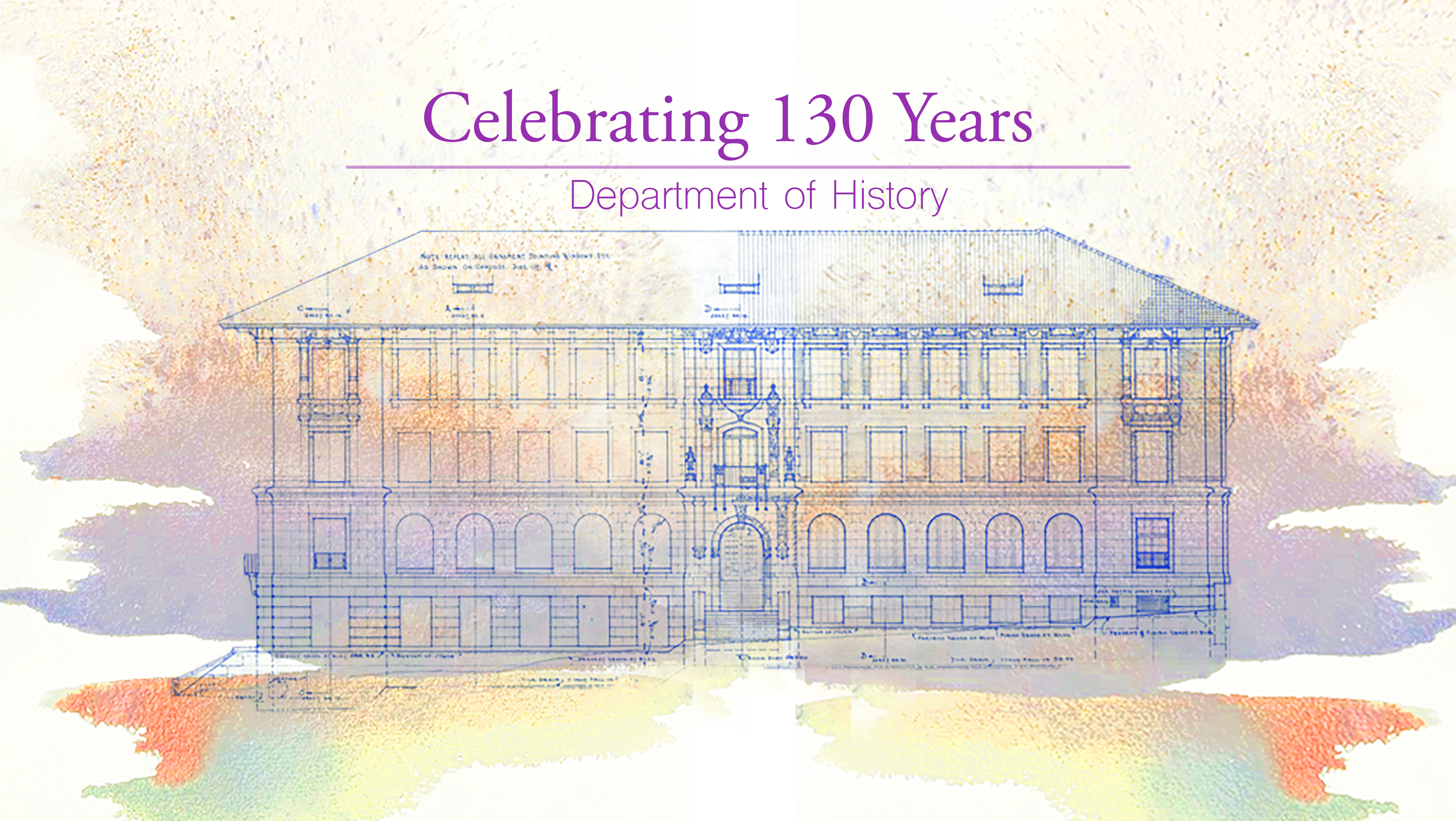
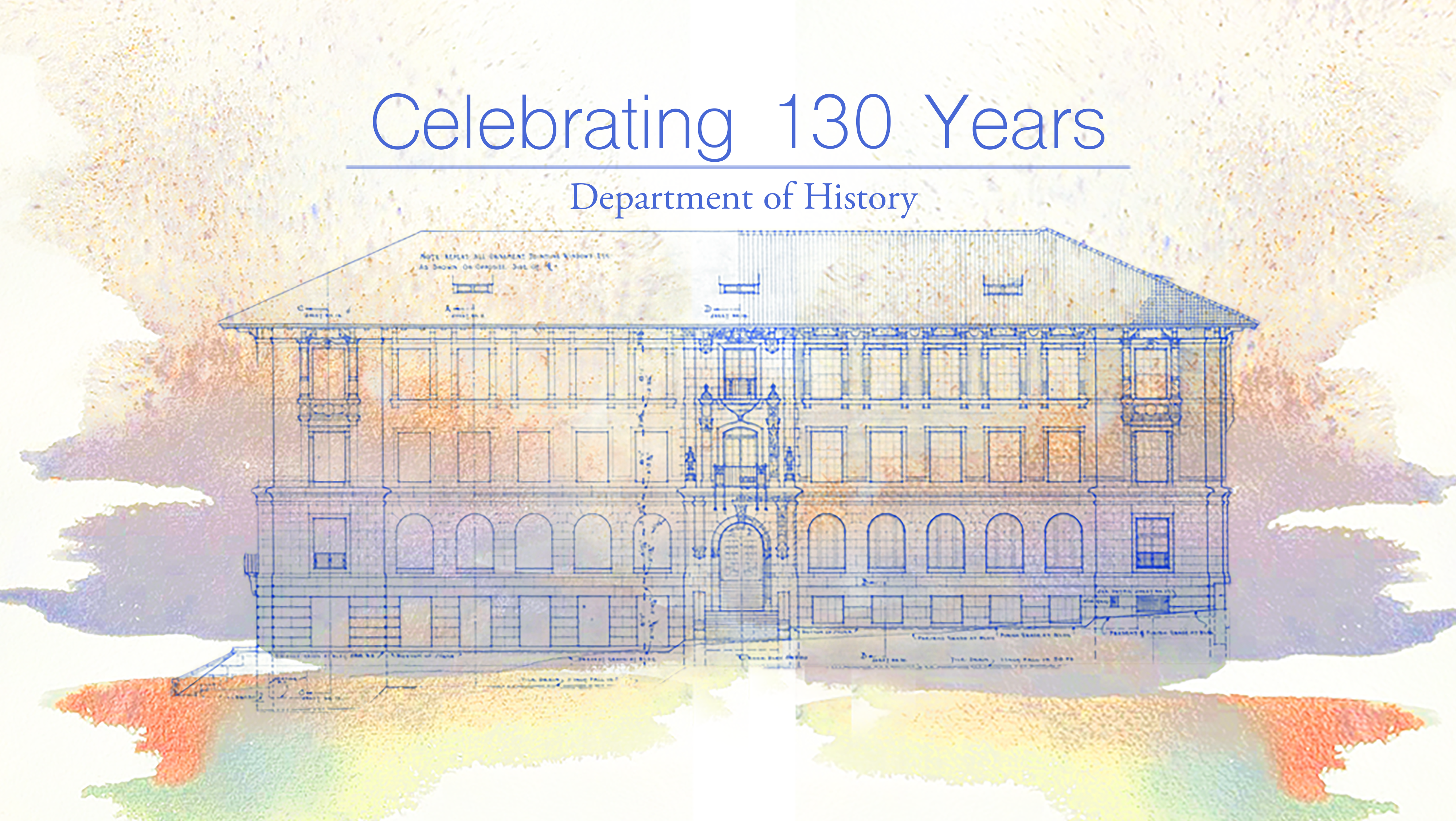
Today I continued working on the History Department Graphic. I messed around with colors, PhotoShop brushes, format, and whatnot. Here are some different versions with mixed typeface and colors:


These are the various versions with different combinations of fonts and formats.
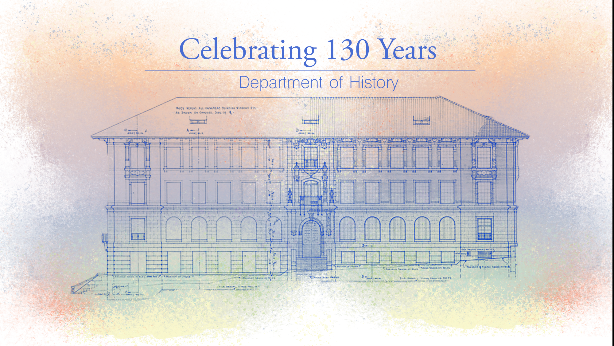
I also started on the paint effect of the graphic since the drafts above used a copyrighted image. I did this through PhotoShop using the “Kyle’s Paintbox- Supreme Spatter and Texture” brush and smudging it. Here’s the result!

Here’s my version of the draft, free of copyright materials!
I think I’m gonna add a little more texture to the paint effect, add some more bright/bold/opaque colors, and make it look less like a butterfly. It’s too symmetrical for my taste currently, so I’m gonna fill the foreground with various colors to make it look more “organic”.