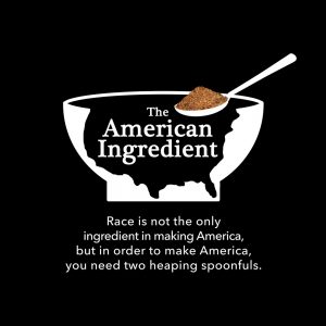
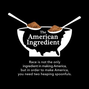
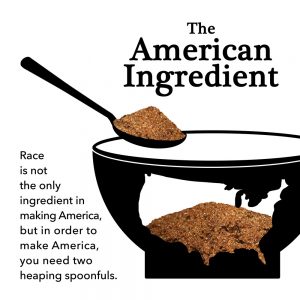
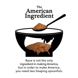
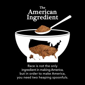
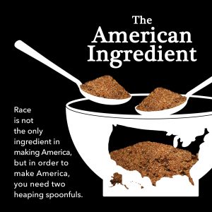
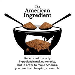
This week I was assigned to create a logo for the American Ingredient podcast. It needed to be black & white and the client had in mind “a white bowl in the shape of the U.S. … Above the bowl would be two spoons with filled something that looked like brown sugar.” After brainstorming a bit, I thought the best way to get the U.S. shape was to create a broken bowl. Here are the initial drafts:
And finals:
If the project was’t constrained to the black & white color scheme, I think a vintage cookbook cover design could be really cool/clever.

