I was assigned to create The Early Indo-European app mockup. The Linguistics Research Center wanted a grant to make the app possible and in order to show the committee (the people in charge of handing out the grant) what they wanted, they needed imagery of the possible app designs. I worked with Dr. Todd Krause, the person who will present these mockups, on what kind of information he wanted within the app. This was a mobile app and everything from the website can’t be placed into the app. The lessons sections, reading and textual analysis and multimedia sections were the areas in the app that needed the most attention. Working with Dr. Todd gave me an experience of what it is like to turn a person’s ideas into something visual. I also provided ideas on how some elements such as video and audio would work. Some sections such as tables and graphs became challenging because some tables and graphs may have a lot of data and although it looks fine on a desktop or tablet device, may not look good on a small phone. I had to think of a way to provide a layout that looked good and was readable on a phone.
When creating the mockup, I went for a minimal approach. The interface and the navigation were not to be cluttered. The color scheme of the navigation made the text easy to read.
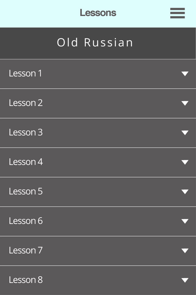
The lessons navigation collapsed
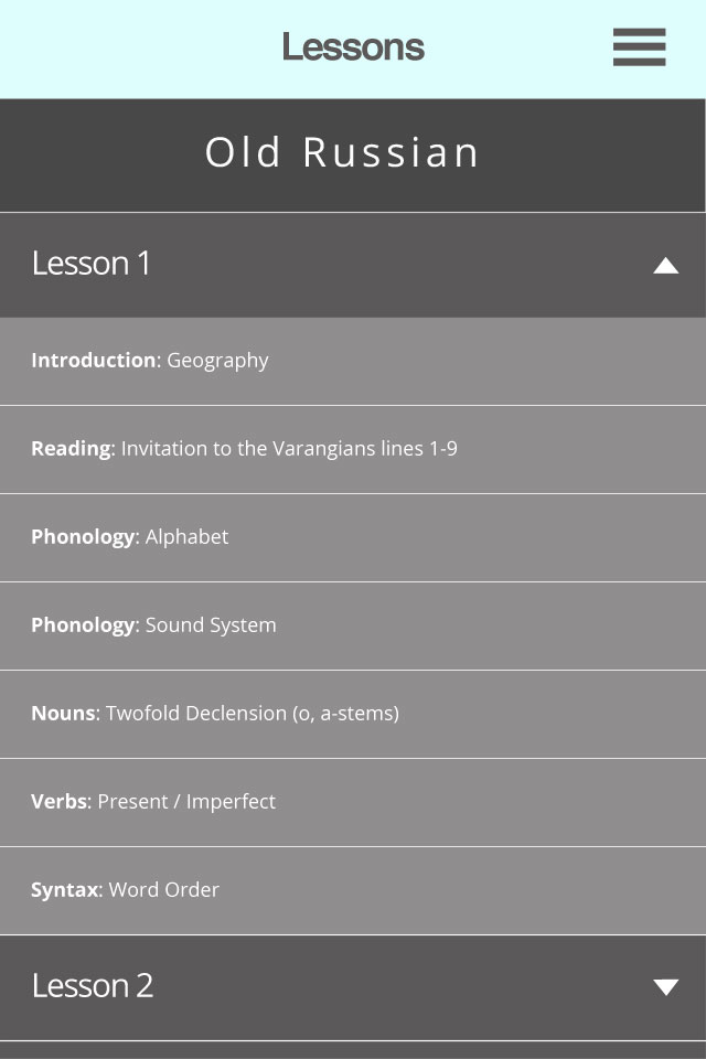
The lessons navigation expanded
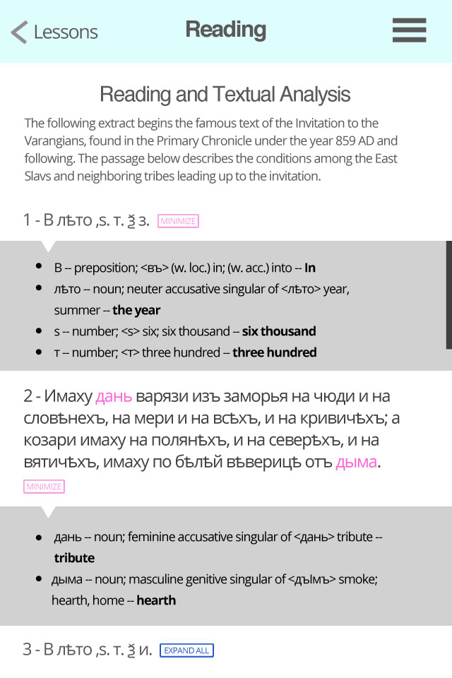
The reading and textual analysis with word highlighting. When a word is selected a box underneath the sentence or paragraph will slide down to show only the words selected (unless you expand all, it will show you all of the words). The box will get up to a certain height, so the user can scroll only within the box instead of scrolling to the bottom of the page and then scrolling all the way back up to read the sentence again.
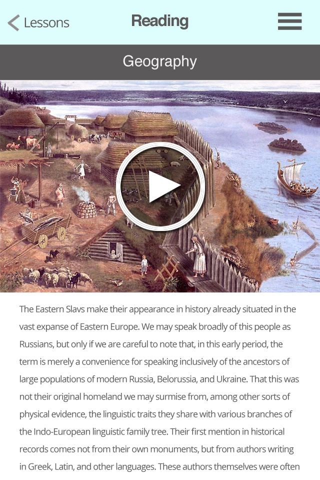
The geography thumbnail so if the user presses the play button the video will go into full screen and play.
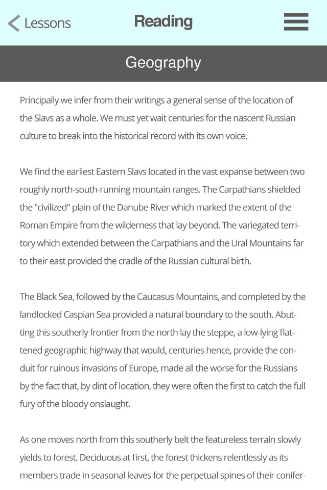
More of the text area when the user scrolls down.
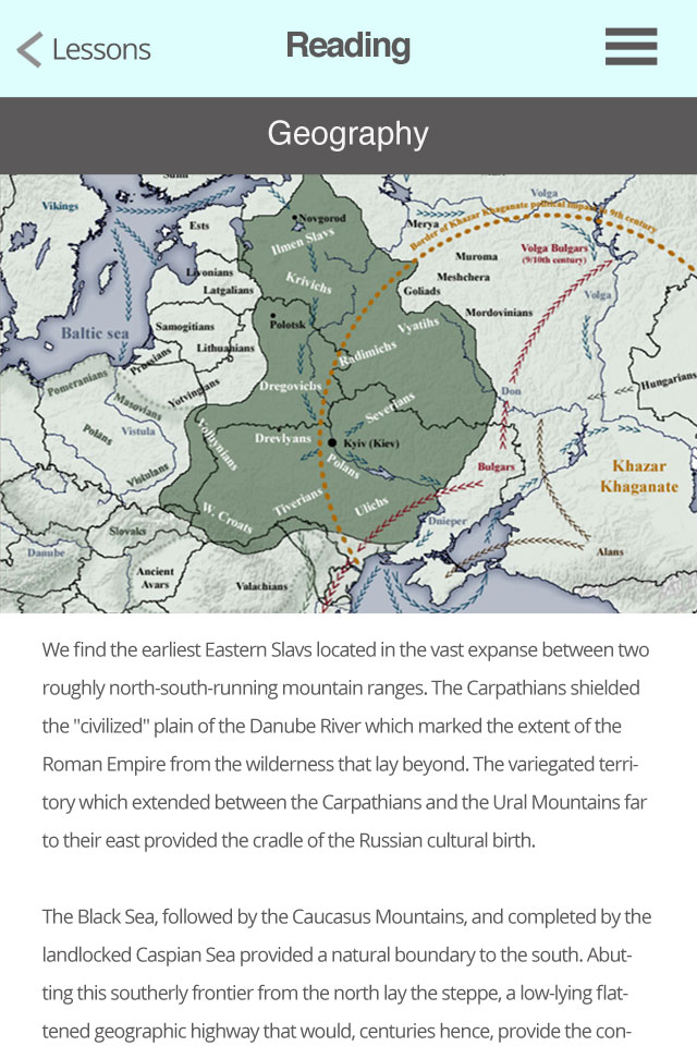
The map section
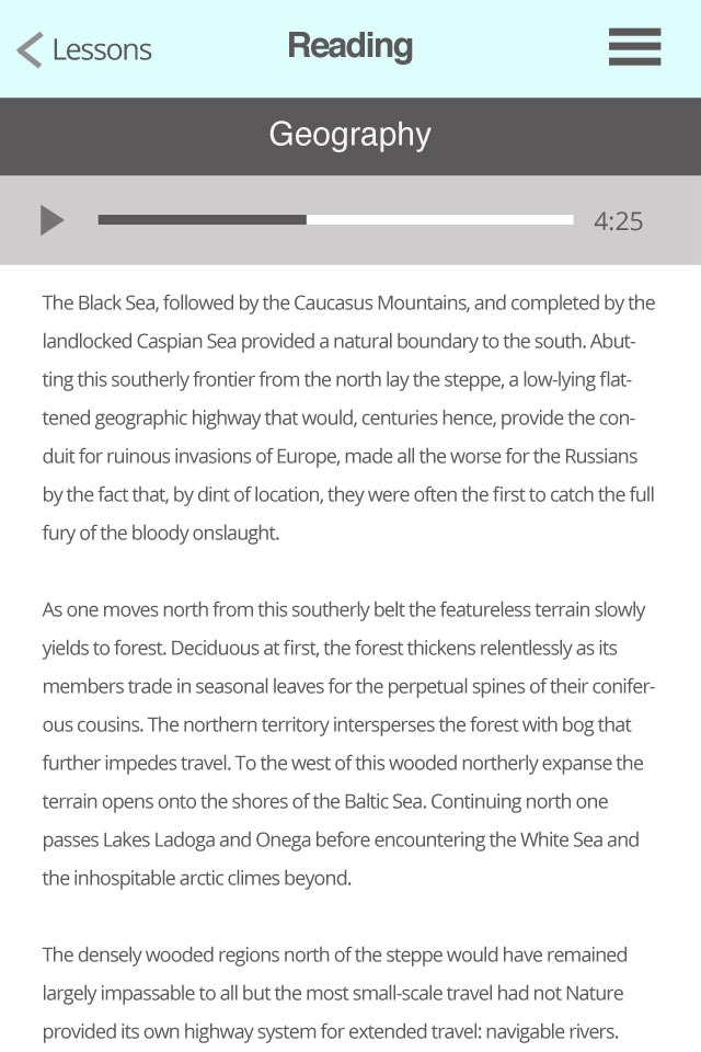
The audio section. The audio bar will remain fixed to the header as the person scrolls down so they can pause when ever they want while reading for example a foreign text.
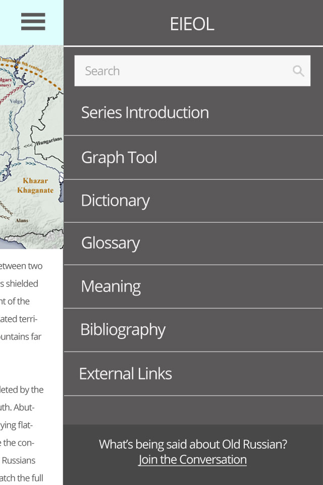
A collapsible menu with sections for each language including a discussion section and bibliography. Lessons is missing because when the user closes the menu and taps to go back, they will reach the lessons section. If they wanted to go to the dictionary, the menu will show all of the sections except the section they are currently in.
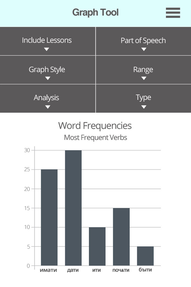
The Graph tool page with options collapsed.
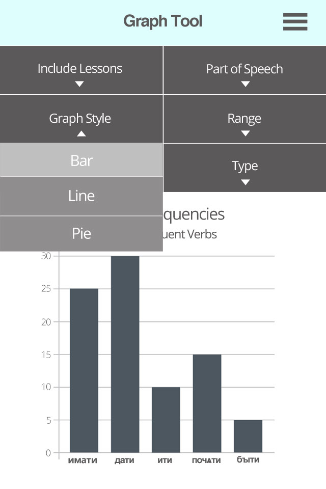
The Graph tool page with options expanded with selection highlighted.
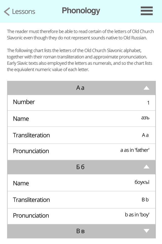
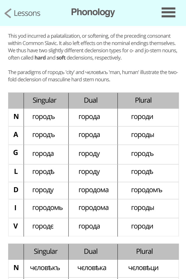
Preview of possible Table layout on mobile. I did some research on possible examples of responsive table layout. It looks like creating a responsive table without the table going off the viewport or scaling down the table to the point of it being unreadable unless you zoom, seems to be a challenging thing to implement. Here is one possibility I came up with where the table headers on the first column become first item on each row. Each table is easy to read and is good for tables that have more than three columns. The problem comes in with really large tables like the alphabet system. Each letter will have their own small table that contains a row for the number, name, transliteration and pronunciation but it will be a large set of tables to scroll down to in order to find a letter that is later in the alphabet. The table could have an accordion-like function so you only select the letters you want to view.
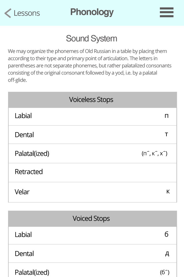
Preview of the alphabet table layout.
Preview of table layout of the twofold declensions. The two tables are separate and not one large table.
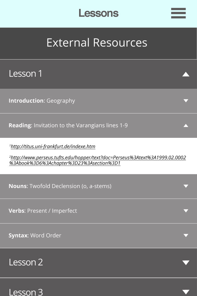
Preview of the external resource menu
