Vlabs UI Design
Today I started developing my ideas for how I want the UI design for Vlabs to look. I began by looking at the already existing sites in our eAnthro suite. Suloni had suggested maybe finding a design element other than the dark shades to tie vlabs in with the other sites and create a cohesive experience when accessing these sites.
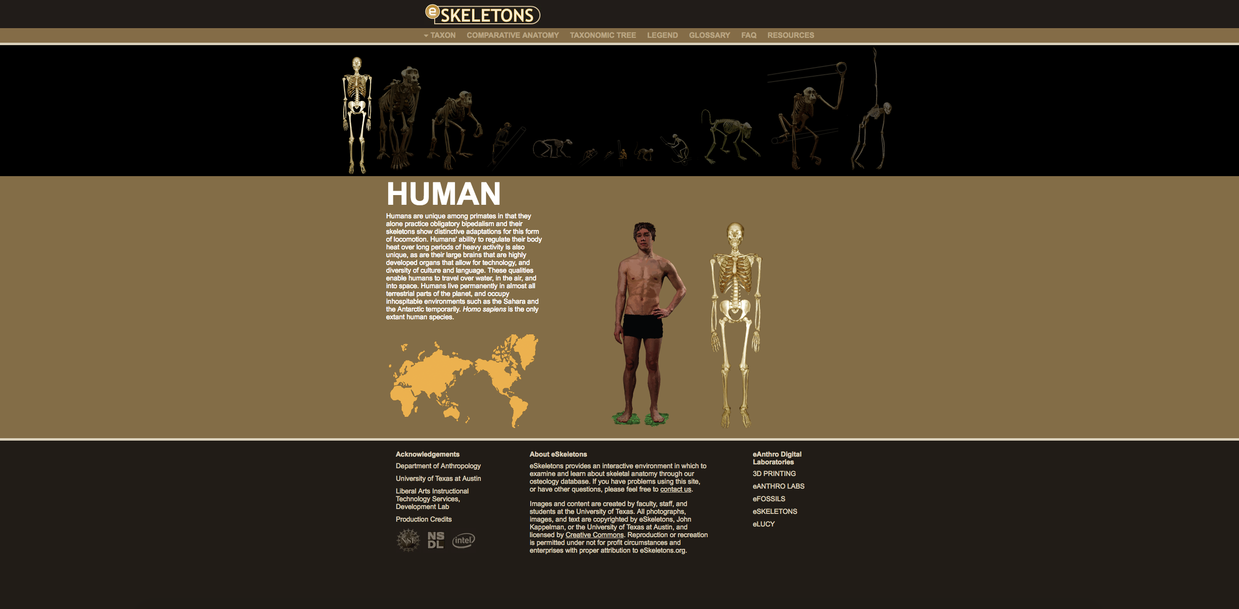
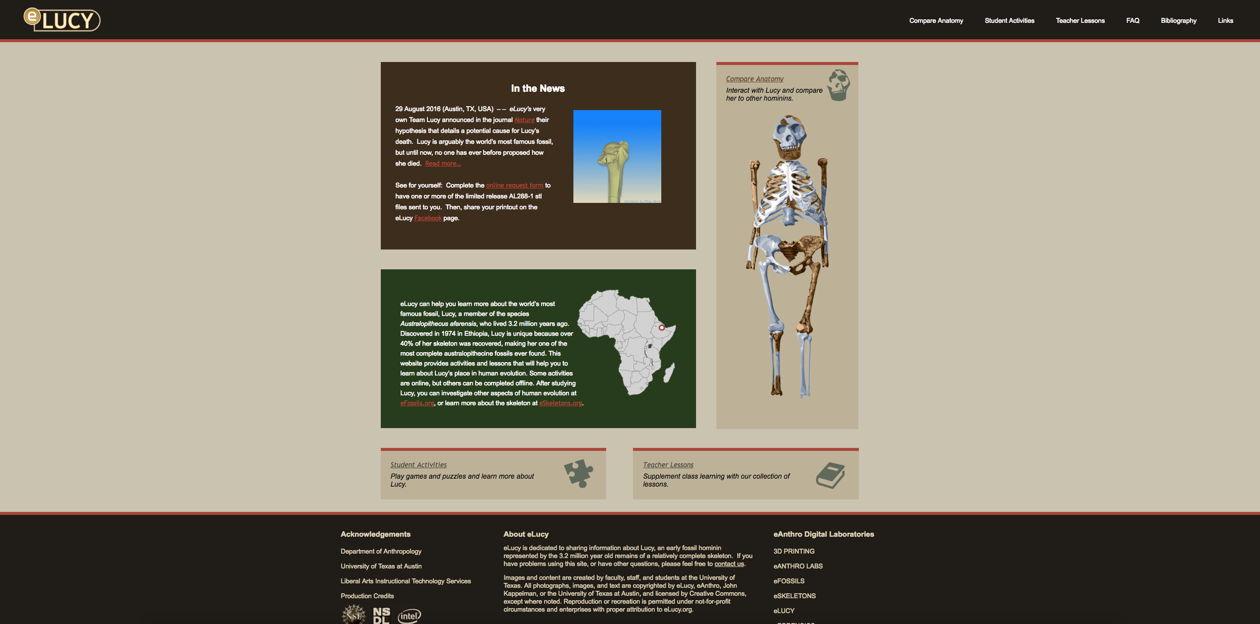
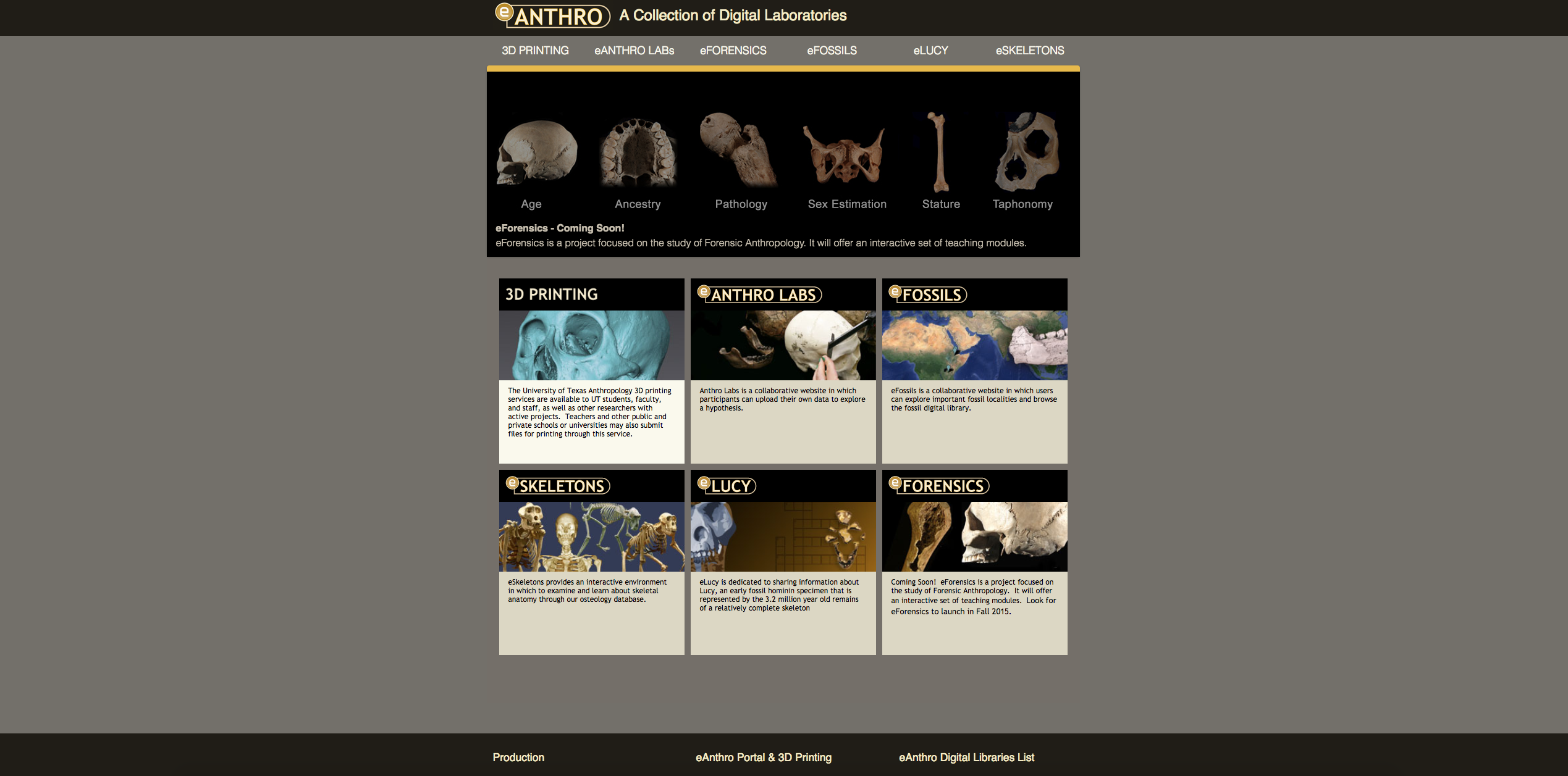
The sites in the eAnthro suite do have a heavy look because of the dark backgrounds and the bright look of Vlabs is refreshing and I don’t want to darken it. But looking through the sites I pulled some colors:
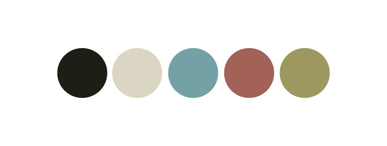
I want to keep the dark brown and tan to maintain some cohesion between the sites; however, they won’t be used extensively but rather more as accent colors. There were also lots of colors I found within the eAnthro suite but I liked the colors above the best. They are bright and colorful but still have earthy and more subdued tones which seems fitting for an anthropology lab.
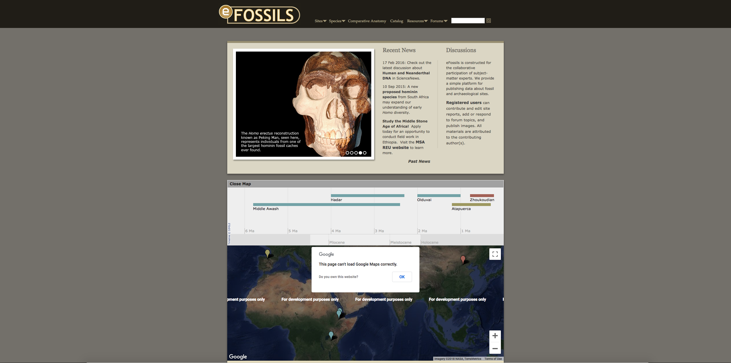
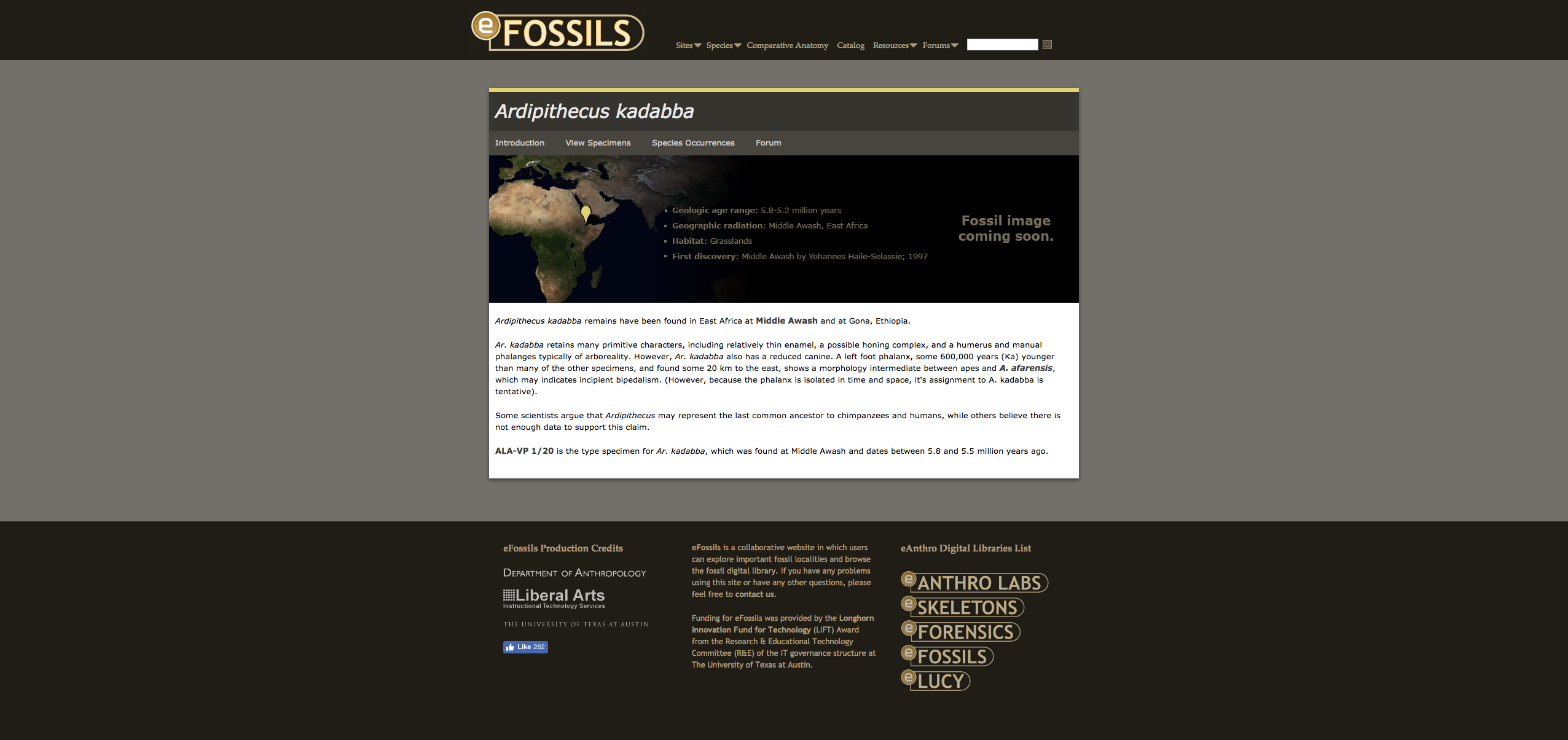
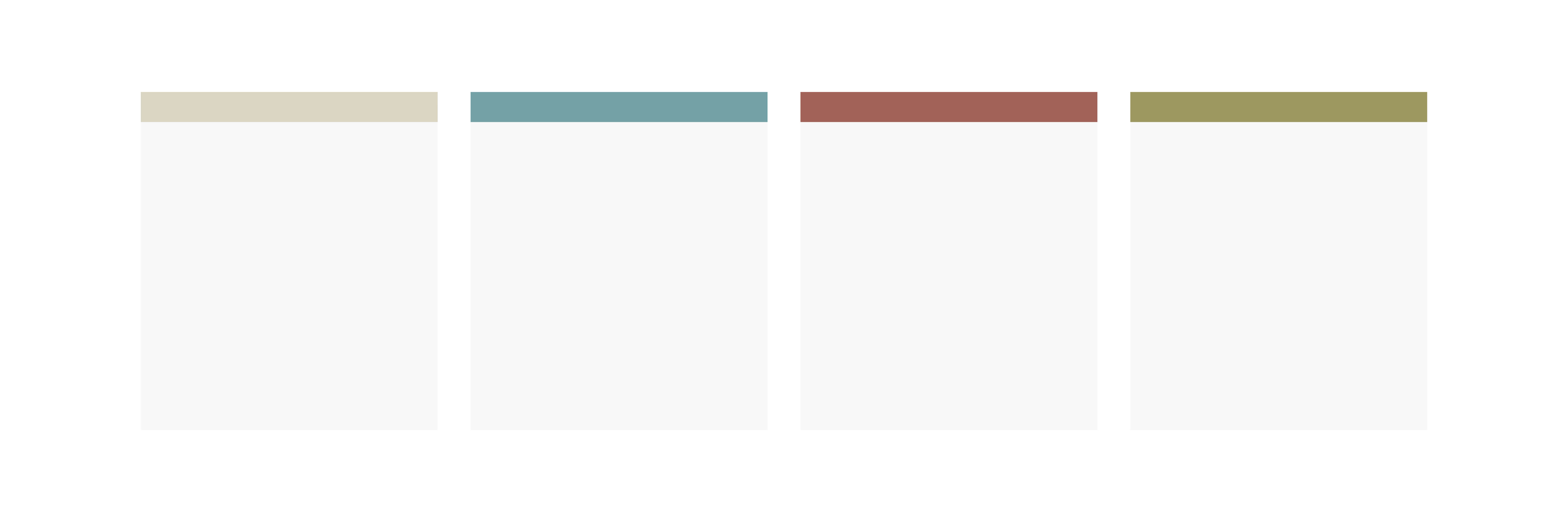
In addition, I noticed that all of the sites in the eAnthro suite utilize a colored bar as a design element. For example these bars found in the eFossils home page banner and the colored bar signifying a section within the site.
This is a design element I can definately bring over to Vlabs when housing the different labs and sections.
I am hoping to have a rough mockup by the end of Friday!