Happy 2019! I’m very thankful to be back at LAITS working as a Design STA for almost 2 years now. Since then, I think I made a lot of progress as a designer and grew a lot just as a person. I’m very excited to work on various projects this semester !!
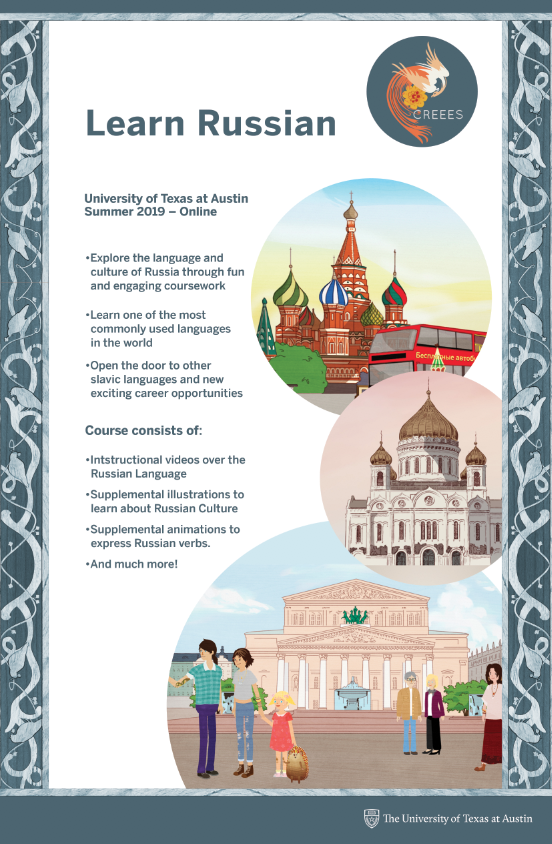
So far, I have been mainly working on the Russian Online Class promotional poster since I got back from winter break. I started off with different drafts for the 8.5 x 11 poster:
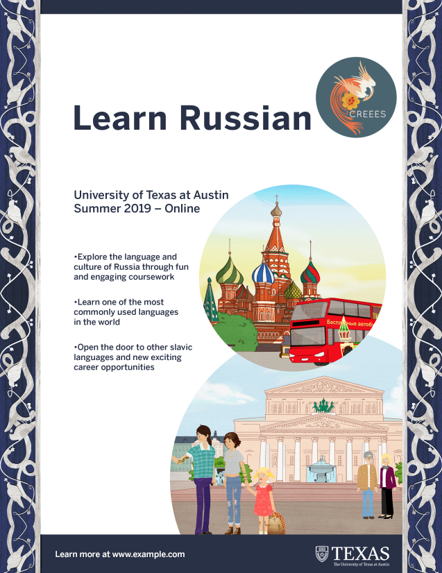
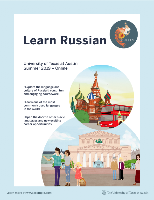
Ultimately, this is the design that I came up with after consulting with Suloni and Tate, as well as getting Dr. Rice and Mike’s approval:
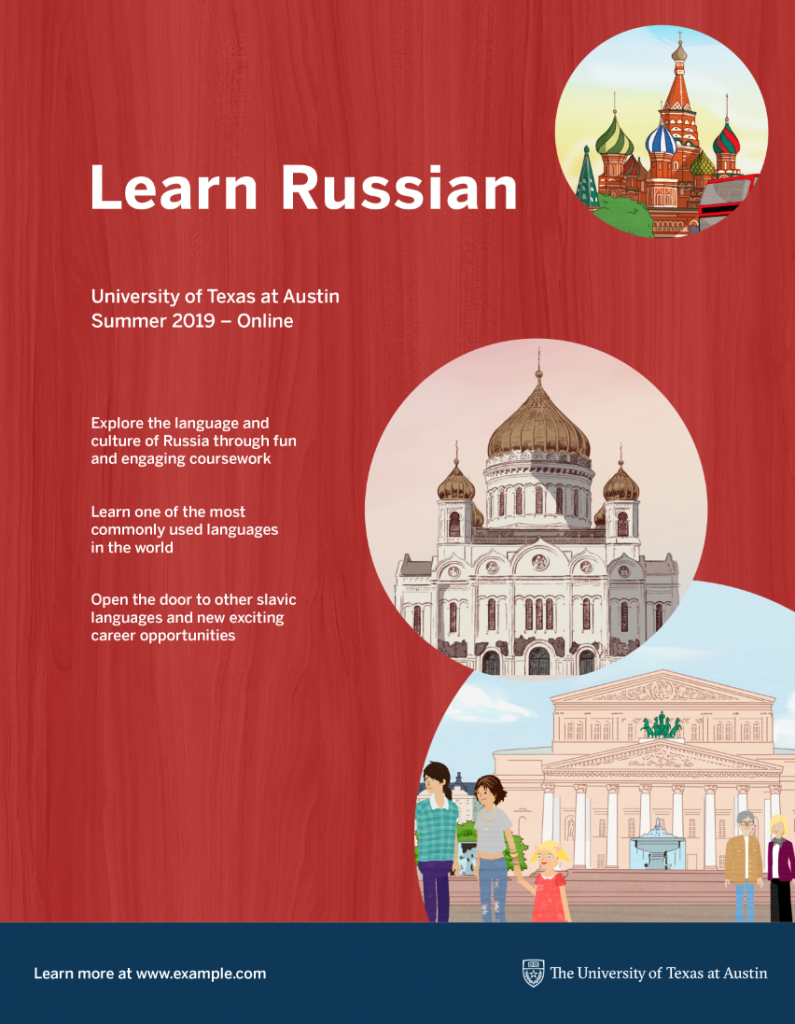
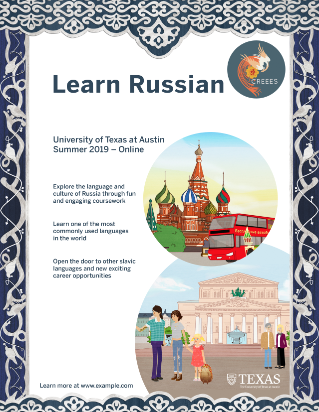
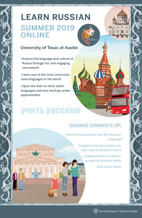
So after the 8.5 x 11 poster, Tate has asked me to make a similar version for the 11 x 17 poster. This is the original one I made:
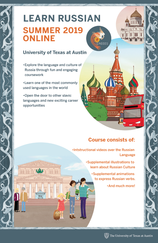
Tate has suggested a few edits I could make, such as:
-Move “Learn Russian” and “Summer 2019 – Online” higher on the poster. Make them all caps and the same size (Roughly the size of “Learn Russian” right now, maybe just a hair smaller)
-Separate the images and the other text more. I recommend moving the large bottom image (with all of the Illustration characters in it) to the left. I also recommend making the CREES logo more of a part of the group of the other two circle images, and move all of those up to the top right.
-Play around with the sizing and color of the text for varied emphasis. Use the reference image we talked about as a guide.
-Also, something I didn’t mention; try to get the text to bend around the circle images a little more! It’s something that happened in your 8.5×11 mockup (either on purpose or not) and balances the poster well!
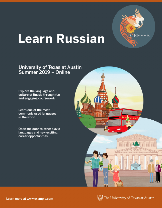
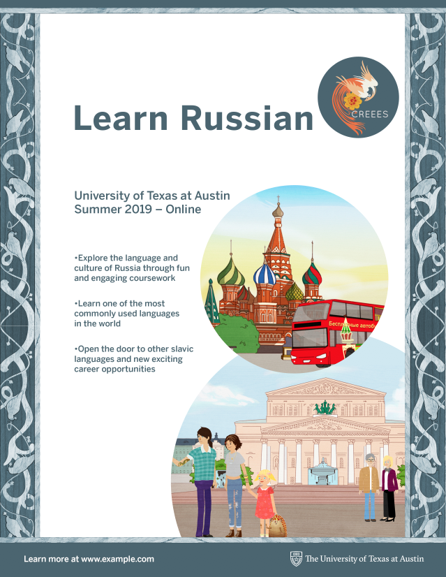
So I made 2 different versions (still not final) – I personally like the blue version better than the orange one, because it encompasses the poster as a whole without overpowering the other colors.
Other than that, I’ve been working on miscellanious things, like photo ID’s, coming up with STA meeting times, Cascade, and talking to Mike about updating the LAITS graphic design website page!