Color Testing Update
It turns out the initial screen I was color testing on had a completely different color profile than most other screens in the office – so while my first round of color edits looked ok to me, the photo highlights looked green or red on most other screens.
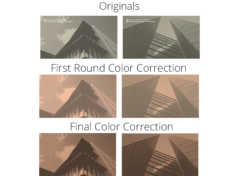
After talking to some LAITS people who knew more about the screens’ color profiles, I stopped playing with hue/saturation and brightness/contrast settings. The screens don’t get “brighter” per say, because pure white/”brightness” only appears as blue. I used a tan and black gradient map and lowered the green/blue highlights and raised red highlights in curves to achieve this effect. The contrast is also nicer on camera now. Knowing how tricky color balancing a neutral like this is on the screens I’m happy with these results!
